How I'm going to grade the applicants
They may have different strengths and weaknesses. I may have to hire multiple freelancers where the sum total of their contributions gives me the whole.
How much effort did they put in?
How effective was their effort?
Their grasp of English, spelling, writing.
Their ability to research. To identify what's of value, and capture it. Convey it to me.
The speed at which they learn.
There ability to understand my requests.
Their SEO talent.
Does anyone else have any other ideas on the criteria I should use to judge candidates according to? Let me know.
I have $10,000 to spend. These are the people who will help me spend it.
Theresa Doghor
Nadezhda Ganova
Nancy Githugo 7.5 out of 10.
Score 8 out of 10
Bold underline I did to emphasize which parts struck me as particularly valuable.
Yellow highlight I did to the notes I added, which her work inspired me to see where we could use her talents in particular areas in the future.
Green emphasized the mistake, yellow was the correction. ie… breakdown of the the ONLY A SINGLE “THE” IS NECESSARY key elements…
Blue was to highlight my notes on possible future terms for our ongoing relationship.
Grey was an addition I thought made complete something she mentioned. Something she overlooked.
For the price of $50 I will do a report on any particular keyword that relates with the keyword for the services advertised on your website.
I have worked at two media companies in the online section of their business so I understand a bit about what you need. I believe that you want to improve your company SEO. Your website probably is not getting as many visits as you would like or maybe it is getting visits or is not converting so you probably need blog posts that people can read and visit your website to get the service they require.
I believe that your website is not mobile friendly and the lines are not fluid. A white interface also works better so I would suggest you get yourself a website designer who makes sure that you get a mobile friendly version because more than 80%of traffic is generated from mobile.
So I clicked on the sand blasting and dustless blasting, from the pictures I gathered that you refurbish vehicles to try to get them to look as good as new. I liked the before and after picture. I believe that some personal stories of your clients giving reviews will do well to improve your business also.
So if I were gathering reports from the internet about sandblasting I would be looking for content that would educate your readers about the benefits of sandblasting, the advantages would also be a selling point for the reader.
The sandblasting job done over the house and the equipment was really good. HERE IS WHERE A LINK/REFERENCE TO THE PAGE YOU’RE REFERRING ABOUT WOULD BE NICE. A major pointer is to put the pictures before the word. What is the saying about pictures being better than a thousand words?
Also if you can get social media and post some information about your company and the different services you have on there that would be a good idea. SOMEWHERE IN THE FUTURE I MAY CONSIDER IT IF I NEED MORE WORK. BUT PERSONALLY I DON’T LIKE SOCIAL MEDIA AND HAVE NO TIME FOR IT. IF THE NEW WEBSITE WE ARE BUILDING BRINGS ME IN ENOUGH WORK, THEN I’LL SKIP SOCIAL MEDIA. IF I NEED MORE WORK THAN WHAT THE WEBSITE CAN BRING IN, THEN I WILL LOOK DEEPER INTO USING SOCIAL MEDIA.
From a professional standpoint, Facebook and LinkedIn would be a good fit for your business. Using a before and after picture with two sentences and then the link to your website will do the trick.
Organizing your website to home page, about us, our services, contact, and blog would be a good fit for your website. Your home page would have a picture that depicts what you do, a brief history of your company and what your vision and mission is. Your about us would talk about your company, the structure and who does what, this helps show your audience how you care for your company. Your services page would show your audience what you do; using a lot of pictures would work here. Your contact page would show people how to reach you via phone and your physical address. Your blog page is where all the reports would be. Each report would link back to the service that the report is focusing on. There should be a contact email on every page and a phone number so you can improve the opportunity of conversions.
Structuring my reports
This is how I would go about structuring my reports. The title and the headline would be very clear because the goal is to help someone who needs help. The goal of every write is to help the reader find what they are looking for. Everyone who comes on the internet is looking for something. They may have hit their car and so need some sandblasting services, they would start typing word on the internet e.g car repairs, body work, repair my car. This is why keywords are important. For every report the focus is spelling out the solution so clear that the online visitor knows that you have what they need and they want to click through to your contact page, your webpage or call the number on the report to talk with the person on the other end.
Reports should have as many pictures as possible in the report so that your audience can see what you are talking about. Technical reports can be boring so you want to get straight to the point in presenting solutions to the audience and having pictures that prove the kind of solutions you serve to your clients and when visit your office.
There are many styles of writing that could work. One of them would be breaking your content into introduction, definition, types and benefits and then giving a conclusion. That would be approximately six chapters for the report that would cover everything that someone searching would need to know. This would start at the layman’s POV and slowly take the leader READER into the subject until they learn the deep parts of the topic being discussed in the report.
For an example of my writing I share my report on social skills and how to develop social skills.
To get the reader interested, I gave an illustration of regular offices and what could happen daily and what would prevent this from happening.
The report is saying in summary, you should learn social skills so that you can keep your job.
The report has the illustration, it has the definition of social skills and then it has examples of the kind of skills you can develop that are referred to as social skills. The report then tells you what the benefits of social skills are, and then the report ends with three action tips of how to improve your social skills. Of course the credits are given when specific research is done.
Here goes:
Karen was easily the best staff in her organization, she did an excellent job almost every time, was innovative and creative. Her organization had made major IS THERE SOMETHING MISSING? via her contributions and although this had not affected her salary, she enjoyed her job so it didn’t matter. When the year ended though, Karen got fired. When she enquired of the reason, she was informed that she was not self-aware nor was she fitting into company culture, she was told that if she was going to move up in management she needed soft skills i.e. social skills.
The above illustration can be interpreted in two different ways: I LOVE THAT YOUR GOING DEEPER IN DEPTH.
· You can see the system as an unfair system and spend some six months moaning and groaning about a company that has done you wrong.
· You can learn your lessons and enrol to develop the skills needed to succeed in the 21st century.
Evaluation: Karen did not have social skills.
What are the skills you need to succeed in the 21st century? A MOST VALUABLE QUESTION.
Social skills are your personal attributes that enable a person to interact effectively and harmoniously with other people in order to accomplish set goals.
Some of the social skills needed to surmount the challenges in the 21st century are:
· People skills
· Social skills
· Communication skills
· Character or personality traits
· Attitudes
· Career attributes
· Social intelligence
· Emotional intelligence quotients
Three social skills which when developed will radically change your perception and outlook towards life are: self-awareness, communication skills, or emotional intelligence.
Self-awareness:
Self-awareness is the capacity for introspection and the ability to recognize oneself as an individual separate from the environment and other individuals. https://www.quora.com/Is-there-a-difference-between-Introspection-and-Self-Awareness I WAS WONDERING IF YOU COPIED SOMEONE ELSE’S ARTICLE AND WAS PASSING IT OFF AS YOUR WORK. BUT THAT WAS NOT WHAT I FOUND. WHAT I DID FIND WAS TRACES OF YOU DOING RESEARCH AND GAINING INSPIRATION FOR YOUR WORK.
You demonstrate self-awareness by keeping an open mind, knowing your strengths and weaknesses. Proper self-awareness lets you remain focused and set the necessary boundaries and following your intuition all while practicing self-discipline. It is your beliefs, motivation and emotions. This helps you in understanding other people, their perception of you, your attitude and response to them.
People with EQ are more likely to build on feedback and become more self-aware. This takes a combination of a high level of ambition and humility to act on one's development plan and persist in the pursuit of higher performance even when it means going against one's nature, and replacing ingrained toxic habits with more effective behavioural tendencies.
Communication skills:
Communication is one of the most important skills that you need to succeed in the workplace. It is speaking, listening, writing and reading effectively. https://www.mindtools.com/pages/article/newCS_99.htm I WAS WONDERING IF YOU COPIED SOMEONE ELSE’S ARTICLE AND WAS PASSING IT OFF AS YOUR WORK. BUT THAT WAS NOT WHAT I FOUND. WHAT I DID FIND WAS TRACES OF YOU DOING RESEARCH AND GAINING INSPIRATION FOR YOUR WORK.
· Emotional Intelligence:
Emotional intelligence is a type of social intelligence that involves the ability to monitor one's own and others' emotions, to discriminate among them, and to use the information to guide one's thinking and actions (Salovey & Mayer, 1990).
The World Economic Forum estimates that 65% of children entering primary school today will end of working in jobs that do not exist today. The major jobs today that are considered useful by the millennial generation and others did not exist ten years ago.
How to Increase Your Emotional Intelligence
· Reflect on your own emotions
· Take a time out and reflect on your use of emotions
· Ask your colleagues or business partners for perspective
· Be observant.
· Use "the pause"
· Discover the "why"
· When criticized, don't take offense.
· Practice makes perfect
SOME GOT PERIODS AND SOME DIDN’T. WHY?
What are three best tips to increase your social skills?
Tip 1: Practice your Non-Verbal Cues
When you communicate with others, take note of the non-verbal communication such as smiling and eye contact.
The amount of attention you give the person you are speaking to determine your appeal. By giving positive cues of eye contact and a warm smile, you are making them feel important and listened to.
Tip 2: Ask Good Questions
Think of smart questions that make the other person talk at length. Use the 80/20 rule. Speak up at least 20% of the time; ensure you are doing the talking. This helps you find something in common with the person you are making small talk with. You might have gone to the same college or they might have been to your favourite place in the world. Find something in common with your companion.
Tip 3: Trigger emotional responses
Our brains are fashioned to make things stress-free and effectual for us, so just like we fall into the practice of brushing our hair again in front of the hall mirror, or falling into bed after lengthy meetings at work, we have similar strategies for dealing with our social patterns.
Don’t say an unenthusiastic ‘fine’ when you are asked how you are doing. Be lively. Say you are having the week of your life. Use bright language, and be present. Red automatically makes me feel lively and happy about everything. Wear bright colours.
MY (Chris’) CONCLUSION:
I liked the writing very much. I liked your insights on web design perspectives although I did not agree 100% with everything you said. Maybe we’ll discuss the differences someday, but doing it today has no gain. But I did agree with you enough to see value in having you do more work for me.
Your test report you turned in, left me unsure if you’re what I’m looking for. However I must admit my guidelines and instructions were very vague. However I saw enough potential I want to test you further with more defined instructions, and have the report to be of real value for our goals. If I like it, we’ll go further next time.
Your next project/test. I want you to find 20 if possible, 10 minimum, videos where a business shows prospective customers, the kind of work they do.
I don’t want to find high dollar commercials made by expensive professionals. I do want to find low budget self-made features that we can follow similar patterns.
Send me links/URL’s of what you found.
Identify and tell me what they did well that we can do also. What they did bad that we want to avoid. Go in depth here, find as much as you can. Document carefully so we know with precision what recipe we want to use when we follow suit. Every to do recipe has as many to avoid aspects. Identify both.
What I’m not looking for. A short report that is highly incomplete and missing a lot of valuable knowledge. I love long and rich. Deep and full.
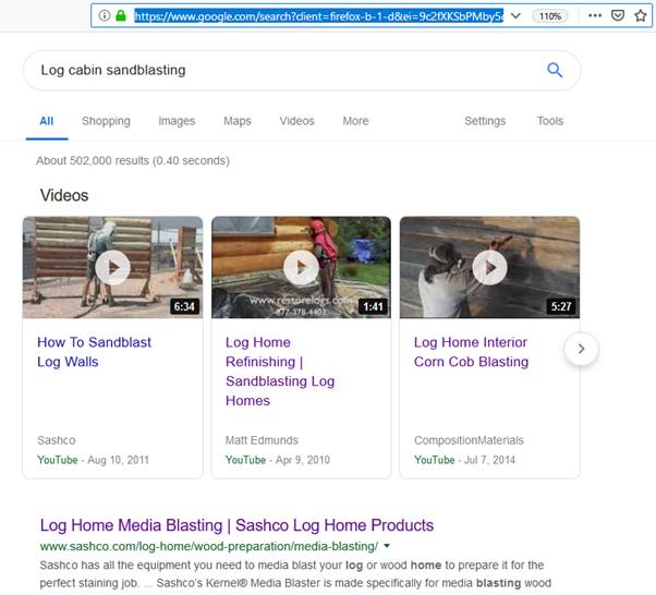
Keywords are important to find an appropriate web article. And in the new website we are now in the design stages of (and your part of), will fully take keywords into account. But google has now for the last 9 months taken it further. Along with googles search results, google is now attempting to offer videos that may answer the question/search query used in google.
This is the search I entered.
Log cabin sandblasting
This link shows you what google showed me. Well, not always. Sometimes google shows different people different results for identical searches, based on google identifying your patterns of searching.
Here is a screen shot of what google showed me, in case you get different results.

Along with a new website, I aim at making dozens of videos that match dozens of keywords.
I want my videos at the top like google is now offering. I already have video footage of 20 different types of sandblasting we have done in the past. And along with having these videos show up at the top of googles search results, these same videos will be on my new website, on the page specific to that topic/type of blasting.
I’m going to hire a video editor and hand them my video footage. I’m considering having you work with that editor and give him instructions on how we want it to turn out. What we are looking for. What we want to avoid. I will record an audio file describing what we are doing in the sandblasting video and give it to you. You will turn that into text content the video editor will use. You will work with her/him, guide them and have them make revisions until you’re happy. Then when you’re happy, I will inspect it and maybe/maybe not want more revisions.
This next test project will pay you $25 for stage 1. If I like what you learn and report to me, I will pay you more and have you go deeper into this study as your next assignment (stage 3). As long as I like what your digging up, we will continue along this line (3,4,5?), until either you’re a expert and ready to work with the video editor, or I see no more value in what your research is coming up with.
The last report you gave me was nothing but a test. But this time I want real info specific to our goals. This time I will answer any questions you have. As many as you may have.
While I want real tangible results, it’s still a test in that I’m evaluating your research and mining abilities. When you can convince me you can design a SEO optimized video to make it to the top of googles search results, then:
1 You will begin working with a video editor being their only source of guidance.
2 We will do this over and over until I have my 20 videos produced.
Then…. Hell, I don’t know. Life has proven to me I can’t predict the future.
While you can study the videos that show up at the top of googles search results page, to see how they got there, you can also study youtubes videos to identify more guidelines we will want when creating our videos.
Are you up for this Theresa?
Theresa Doghor Remake request of 3rd report
1. Sawdust
The first video is a handy man. He did a video to show his viewers ten different ways that saw dust can be used.
The music had a calming effect. It was a sound track with no words. His narratives in the video were also useful. The words used for the narrative were on a white blank surface and clear. The second song (sound track) was also calming so as not to make it monotonous. I think he used free songs so as not to break copyright. If we have a particular song made for the brand, the song could be used at the beginning and serve as brand identity for the company’s brand image (I speak for your brand).
He has 1,003,325 views and the video was uploaded on the 22 Sept 2016. It has 3.5K likes and 1.4K dislikes. The ratio of likes to dislikes is 5:2. More people like the post than dislike it.
The video was shot with background music and sub titles, he used more than one song. He went for a fun video instead of text book video. He had something funny to say or made some observation after each point was made.
When I put up the keyword ‘saw dust’ in the google tab, a couple of results came up, I scrolled down to check the top videos and he was number 1.
In the YouTube description box put up his product page link he gave a few pointers about sawdust, put up a link to the full article and advertised his social channels. He also gave credit to the owners of the music he used.
He never spoke.
Speeding up the boring parts is a yes for the brand so people can watch the video till the end.
(#Sawdust #Woodwork #Workshop)
He used the above hashtag as the last line in the description box. This might be the secret ingredient to showing up as a popular video aside from the one million views on the YouTube video.
His video is number 1 in the google search results when you put in the keyword ‘sawdust’. When I put the exact same keyword in the YouTube box he came up first again.
None of the other videos made it to the top three lists on google search bar.
Google Link to search results:
When I searched for sawdust on the YouTube box, the video still made the cut. I think the keyword has a role to play and the number of times the keyword has been searched by other people.
SOME KEYWORDS SEARCHED ON GOOGLE, DON’T PULL UP A VIDEO. SHOULD WE EXAMINE YOUTUBE TO SEE IF THAT SAME KEYWORD PRODUCES THE SAME RESULTS? IS IT BECAUSE THERE ARE NO VIDEOS FOR THOSE KEYWORDS? OR BECAUSE THE VIDEOS THAT DO EXIST, FAIL BY SOME INVISIBLE STANDARD WHICH WE ARE HUNTING TO DISCOVER?
He has over a million views while the others are in the range of 217,000.
The last video had 1,293,073 views, so the description box with descriptions in them probably helps the video to be found.
He had 38,000 subscribers. The other two individuals that made it to the top three on the YouTube page had 18K plus and 2.1K plus subscribers respectively. They made their post in 2018 and 2010 respectively. So the year posted doesn’t seem to play a major factor in being the best three videos.
When I searched about five times, this is what came up.
COMPARISON BETWEEN THE THREE VIDEOS
First video:
The video that was first in the google search had 1,003,325 views It has 3.5K likes and 1.4K dislikes. The ratio of likes to dislikes is 5:2.
The video was uploaded on the 22 Sept 2016.
Second video:
18,000 subscribers
219 likes and 16 dislikes
The video was made in 2018
Third video:
2.1K subscriber
4.4K likes and 279 dislikes
The video was made in 2010.
The videos had similar lighting. The second video had voice while the third video had a soundtrack.
Questions
Why did his video always show up in the 1st place?
· Number of views
· Date that the video was uploaded
· Youtube ads
· Google ads
· Lighting of the ads
· Using soft and calming music
· Defining the niche clear
· Using the youtube box to advertise your website address, write a transcript of the video and to advertise your social media channels
Why was it the videos youtube showed for 2nd and 3rd place, were not good enough to make it to googles search page results for 2nd and 3rd place.
It can be any number of factors including:
· It can be time
· Quality of video
· Different topic
· The budget of the ads
· The use or lack of use of hashtags
· It might not have received acceptance from the public
The three topics were talking about the usefulness of saw dust so we can stick to focusing on benefits of sandblasting.
Do a different video for each kind of sandblasting.
Why did youtubes 4th result show up in googles search page as 2nd results?
There is a degree of probability involved in this. They know the videos that people look for and find more often and they will most likely go with what many viewers are watching. They also had about 133 comments. So the comments show interest from the audience on the video.
Why was youtubes 2nd and 3rd ahead of the 4th in youtube, but it still didn’t make 1-3 on googles search page results?
Chance. I searched for the same key word five times and came up with the screenshot above.
Research instructions:
1. Identify what we want. This research project is about figuring out how some videos make it to the top of goggles search results page, so we can copy that winning technique and get my new videos that we have not made yet, to the top of googles search results.
· We want to create research videos on sandblasting and drive traffic to our website through this video WE WANT TO DO RESEARCH SO LATER WHEN WE CREATE VIDEOS ON SANDBLASTING, WE WILL KNOW WHAT TO DO SO OUR VIDEOS MAKE IT TO THE TOP OF GOOGLES SEARCH RESULTS. WHEN GOOGLE OFFERS OUR VIDEOS ON THE TOP OF ITS SEARCH PAGE, VIEWERS WILL SEE MY COMPANY DOING WHAT IT IS THAT THEY SEARCHED FORM. THEN THEY WILL BE MORE LIKELY TO HIRE ME AS THEY SAW MY VIDEO AND THEY DID NOT PICK SOME OTHER SEARCH RESULT AND TO GO TO SOMEONE ELSE’S WEBSITE.
· We want natural videos that will show the finished work to our audience so that they will want to use our services. I DON’T HAVE $5,000 TO SPEND PER VIDEO, TIMES 20 VIDEOS, TO HIRE A PROFESSIONAL STUDIO TO MAKE EDIT/MAKE VIDEOS FOR ME. THERE ARE MANY HOMEMADE VIDEOS OUT THERE THAT HAVE GOTTEN TO THE TOP OF GOOGLES SEARCH RESULTS PAGE. OURS WILL BE HOMEMADE ALSO AS THEIRS. BUT WHAT ELSE DID THEY DO RIGHT THAT GOT THEM TO THE TOP, WHICH WE MUST ALSO IMITATE SO WE GET TO THE TOP?
· We want videos that will help the viewer understand what sandblasting is. NO.
THIS IS NOT FREE EDUCATION TIME. IF YOU WANT YOUR BOAT SANDBLASTED AND YOU’RE LOOKING FOR A COMPANY TO HIRE, AND YOU SEARCH BOAT SANDBLASTING IN GOOGLE, I WANT MY BOAT SANDBLASTING VIDEO TO COME UP AT THE TOP. BEFORE YOU GO TO SOMEONE’S WEBSITE, YOU’RE HIGHLY LIKELY TO WATCH A VIDEO ON BOAT SANDBLASTING, WHICH IS WHAT YOU JUST SEARCHED FOR. IN MY BOAT SANDBLASTING VIDEO, I AIM TO CONVINCE YOU TO HIRE ME SINCE YOU’VE SEEN PROOF WATCHING THE VIDEO, THAT WE DO GOOD WORK WHEN SANDBLASTING BOATS. NOW YOU CAN CALL ME FROM WATCHING THE VIDEO WITHOUT EVER GOING TO MY COMPETITORS WEBSITE. AND MY VIDEO DESCRIPTION WILL HAVE A LINK TO MY WEBSITE.
THIS IS NOT FREE EDUCATION TIME. IF YOU WANT YOUR AUTOMOBILE SANDBLASTED AND YOU’RE LOOKING FOR A COMPANY TO HIRE, AND YOU SEARCH AUTOMOBILE SANDBLASTING IN GOOGLE, I WANT MY AUTOMOBILE SANDBLASTING VIDEO TO COME UP AT THE TOP. BEFORE YOU GO TO SOMEONE’S WEBSITE, YOU’RE HIGHLY LIKELY TO WATCH A VIDEO ON AUTOMOBILE SANDBLASTING, WHICH IS WHAT YOU JUST SEARCHED FOR. IN MY AUTOMOBILE SANDBLASTING VIDEO, I AIM TO CONVINCE YOU TO HIRE ME SINCE YOU’VE SEEN PROOF WATCHING THE VIDEO, THAT WE DO GOOD WORK WHEN SANDBLASTING AUTOMOBILE S. NOW YOU CAN CALL ME FROM WATCHING THE VIDEO WITHOUT EVER GOING TO MY COMPETITORS WEBSITE. AND MY VIDEO DESCRIPTION WILL HAVE A LINK TO MY WEBSITE.
· We want videos that will help the viewer understand what sandblasting is. NO.
BUT IS THAT WHY THE VIDEOS THAT MADE IT TO THE TOP OF GOOGLES SEARCH RESULTS PAGE SUCCEEDED? BECAUSE THEY WERE EDUCATIONAL AND NOT PROMOTIONAL? OR CAN THEY BE BOTH EDUCATIONAL AND PROMOTIONAL AND STILL SUCCEED? OR DOES IT JUST HAVE TO BE INTERESTING SO THE VIEWER STAYS AND WATCHES THE WHOLE THING? WE NEED THESE ANSWERS. SINCE WE DON’T KNOW WHAT WERE LOOKING FOR, WE INITIALLY HAVE TO EXAMINE AND RECORD EVERYTHING.
2. What criteria we are examining so we know how to get what we want.
WE ARE EXAMINING EVERYTHING WE CAN MAKE OURSELVES NOTICE AND MAKE A RECORD OF. INITIALLY WE DON’T KNOW WHAT WE ARE LOOKING FOR, SO WE TAKE OUR BEST GUESS IN WHAT TO MAKE NOTES OF. WE AE LOOKING FOR A PATTERN ACROSS MANY VIDEOS RESEARCHED, THAT WILL HELP US IDENTIFY WHAT CRITERIA GOOGLE USES WHEN GOOGLE DECIDES TO SHOW OR NOT SHOW A VIDEO ON ITS SEARCH RESULTS PAGE. I DON’T CARE ABOUT YOUTUBES CRITERIA, BUT ONLY GOOGLES SEARCH RESULTS PAGE. HOWEVER THE FACT THAT YOUTUBE SEES POTENTIAL IN A VIDEO SO YOUTUBE DECIDES TO SHOW IT AT THE TOP OF YOUTUBES SEARCH RESULT PAGE, BUT YET IT STILL WONT MAKE IT TO GOOGLES SEARCH RESULT PAGE, MIGHT HELP GIVE US INDICATORS OF WHAT THE FAIL GRADE IS.
THERE ARE TWO THRESHOLDS. WHY DID IT SUCCEED? WHY DID IT FAIL? WE NEED TO KNOW BOTH OF THEM.
WE ARE EXAMINING EVERYTHING WE CAN MAKE OURSELVES NOTICE AND MAKE A RECORD OF. INITIALLY WE DON’T KNOW WHAT WE ARE LOOKING FOR, SO WE TAKE OUR BEST GUESS IN WHAT TO MAKE NOTES OF. AS THE HIGHER THE QUANTITY OF VIDEOS BECOMES THAT WE CAREFULLY RESEARCHED, THE MORE WE WILL BEGIN TO RECOGNIZE THE PATTERNS, THE INDICATORS FOR SUCCESS AND FAILURE. THE FIRST FEW VIDEOS WE MIGHT NOT SEE ANY PATTERN AT ALL. BUT THE MORE WE KEEP LOOKING, THE MORE THE ANSWER WILL GROW BEFORE OUR EYES.
AS WE RESEARCH AND DIG UP POSSIBLE ANSWERS, WE NEED A PLACE TO PUT OUR FINDINGS SO WE CAN COMPARE THEM WITH FUTURE RESEARCHED VIDEOS AND LATER ANALYSIS. I’M HOPING YOU CAN LATER PUT OUR MINED DATA IN A SPREAD SHEET OR GRAPH SO WE CAN HUNT FOR PATTERNS. BUT IF YOU CANNOT HANDLE THE DATA FILTERING AND ANALYSIS, NOT A BIG DEAL. I CAN FIND SOMEONE TO DO THAT LATER AFTER WE’VE EXAMINED CLOSELY 20 OR MORE VIDEOS. FOR NOW YOU CAN FOCUS ON EXAMINING A SUCCESSFUL VIDEO AND ITS FAILED COMPETITORS CLOSELY MAKING AS DETAILED NOTES AND RECORDS AS POSSIBLE.
YOUR JOB IS TO DIG UP AND RECORD THE DATA. LATER WE CAN FILTER AND ANALYZE IT.
· Number of views
· Description box information
· Lighting of video
· Quality of camera
· Great script with a flow of words describing the short video
3. What criteria are we examining so we can identify the distinguishing factors that are make or break factors.
· Likeability of the video
· Lighting of the video
· Background music
· Words for narrating the important points
· Advertising using google ads/YouTube ads
· Number of subscribers of YouTube channel
· Likes or dislikes of video indicate engagement
· Clear voice with a conversational tone
ALL OF THIS YES. PLUS EVERYTHING ELSE WE DISCUSSED.
MAYBE THERE ARE 20, OR 40 FACETS OF A VIDEO THAT WE EXAMINE AND MAKE NOTE OF. SO WE RECORD THOSE 40 PIECES OF INFORMATION FROM OUR SAWDUST VIDEO THAT MADE IT TO 1ST PLACE ON GOOGLES SEARCH RESULTS.
NOW WE EXAMINE THE VIDEO THAT MADE IT TO 2ND PLACE ON GOOGLES SEARCH RESULTS. WE MUST GO AND MAKE ANOTHER RECORD OF THOSE SAME 40 PIECES OF INFORMATION, SO LATER THEY CAN BE COMPARED.
NOW WE EXAMINE THE VIDEO THAT MADE IT TO 3RD PLACE ON GOOGLES SEARCH RESULTS. WE MUST GO AND MAKE ANOTHER RECORD OF THOSE SAME 40 PIECES OF INFORMATION, SO LATER THEY CAN BE COMPARED.
NOW WE EXAMINE THE VIDEOS THAT MADE IT TO YOUTUBES 1ST PLACE, BUT DIDN’T MAKE IT TO GOOGLES SEARCH RESULTS. WE MUST GO AND MAKE ANOTHER RECORD OF THOSE SAME 40 PIECES OF INFORMATION, SO LATER THEY CAN BE COMPARED.
NOW WE EXAMINE THE VIDEOS THAT MADE IT TO YOUTUBES 2ND PLACE, BUT DIDN’T MAKE IT TO GOOGLES SEARCH RESULTS. WE MUST GO AND MAKE ANOTHER RECORD OF THOSE SAME 40 PIECES OF INFORMATION, SO LATER THEY CAN BE COMPARED.
NOW WE EXAMINE THE VIDEOS THAT MADE IT TO YOUTUBES 3RD PLACE, BUT DIDN’T MAKE IT TO GOOGLES SEARCH RESULTS. WE MUST GO AND MAKE ANOTHER RECORD OF THOSE SAME 40 PIECES OF INFORMATION, SO LATER THEY CAN BE COMPARED.
NOW WE EXAMINE THE VIDEOS THAT MADE IT TO YOUTUBES 4TH PLACE, BUT DIDN’T MAKE IT TO GOOGLES SEARCH RESULTS. WE MUST GO AND MAKE ANOTHER RECORD OF THOSE SAME 40 PIECES OF INFORMATION, SO LATER THEY CAN BE COMPARED.
WHAT WE DECIDE TO MAKE A RECORD OF FROM ONE VIDEO, WE MUST ALSO RECORD FROM EVERY OTHER VIDEO, OR WE CAN FIND THE PATTERNS.
I SAY 40 PIECES OF INFO. I SAY THAT JUST AS AN EXAMPLE. MAYBE ITS 15, MAYBE ITS 55. BUT WHATEVER WE DECIDE TO EXAMINE FOR CLUES, WE MUST ALSO EXAMINE ON ALL SUBSEQUENT VIDEOS. WE CANT FAIL TO EXAMINE THE 10TH VIDEO FOR CLUES IN A AREA THAT WE DID EXAMINE THE PREVIOUS 5 VIDEOS IN, OR WE CAN FAIL TO NOTICE SOMETHING IMPORTANT IF WE ARE NOT CONSISTENT AND DILIGENT.
WHAT I AM TRYING TO GET YOU TO LEARN AT THIS STAGE, IS WHAT CATEGORIES DO WE EXAMINE AND MAKE A RECORD OF?
WHAT I AM TRYING TO GET YOU TO LEARN AT THIS STAGE, IS WHAT CLUE INDICATORS DO WE EXAMINE AND MAKE A RECORD OF?
WHAT I AM TRYING TO GET YOU TO LEARN AT THIS STAGE, IS WHAT TYPES OF PATTERNS DO WE EXAMINE AND MAKE A RECORD OF?
WHAT I AM TRYING TO GET YOU TO LEARN AT THIS STAGE, IS HOW MANY POSSIBLE DIFFERENT INDICATORS DO WE WATCH OUT FOR, EXAMINE IN DEPTH? AND OF COURSE RECORD.
THIS STAGE IS ABOUT LEARNING TO IDENTIFY WHAT IS WORTH IDENTIFYING.
WHEN WE IDENTIFY A PIECE OR CLUE TO WATCH FOR, WE MUST MAKE SURE WE EXAMINE ALL FUTURE VIDEOS FOR THE SAME TELL TALE SIGN.
WHEN WE IDENTIFY A PIECE OR CLUE TO WATCH FOR, WE MUST HAVE A PLACE TO RECORD IT THAT IS THE SAME FOR ALL FUTURE VIDEOS SO COMPARISONS CAN BE MADE QUICKLY, EASILY AND ACCURATELY.
Ggl src rslt 1st plc | Ggl src rslt 2nd plc | Ggl src rslt 3rd plc | Videos at the top of youtube that failed to make it t Gls Src rstl plc | Videos at the top of youtube that failed to make it t Gls Src rstl plc | Videos at the top of youtube that failed to make it t Gls Src rstl plc |
Keywords searched. Be specific and precise. | Keywords searched. | Keywords searched. | Keywords searched. | Keywords searched. | Keywords searched. |
Google search results page video ranking. His video is number 1 in the google search results when you put in the keyword ‘sawdust’. When I put the exact same keyword in the YouTube box he came up first again. | Google search results page video ranking. For the same keywords, which video came in 2nd place on googles search results page? | Google search results page video ranking. For the same keywords, which video came in 3rd place on googles search results page? | For the same keywords, which video made it to the top of youtubes search results, that did not make it to googles search results. | For the same keywords, which video made it to the top of youtubes search results, that did not make it to googles search results. | For the same keywords, which video made it to the top of youtubes search results, that did not make it to googles search results. |
Music NO? If YES, what type of music? music had a calming effect. It was a sound track with no words. | Music NO? If YES, what type of music? The second video had voice while the third video had a soundtrack. | Music NO? If YES, what type of music? while the third video had a soundtrack. | Music NO? If YES, what type of music? | Music NO? If YES, what type of music? | |
Narratives in the video Yes or No? Large, medium or small text? Audio descriptions in the video Yes or No? narratives in the video were also useful. The words used for the narrative were on a white blank surface and clear | Narratives in the video Yes or No? Large, medium or small text? Audio descriptions in the video Yes or No? | Narratives in the video Yes or No? Large, medium or small text? Audio descriptions in the video Yes or No? | Narratives in the video Yes or No? Large, medium or small text? Audio descriptions in the video Yes or No? | Narratives in the video Yes or No? Large, medium or small text? Audio descriptions in the video Yes or No? | |
He had 38,000 subscribers. The other two individuals that made it to the top three on the YouTube page had 18K plus and 2.1K plus subscribers respectively. | The other two individuals that made it to the top three on the YouTube page had 18K plus and 2.1K plus subscribers respectively. | and 2.1K plus subscribers respectively. | |||
He has 1,003,325 views He has over a million views while the others are in the range of 217,000. | |||||
The last video had 1,293,073 views, so the description box with descriptions in them probably helps the video to be found. What was the last video you are referring to? Be clear! These numbers differ so you must be referring to another video? | |||||
video was uploaded on the 22 Sept 2016 | They made their post in 2018 and 2010 respectively. So the year posted doesn’t seem to play a major factor in being the best three videos. | and 2010 respectively. So the year posted doesn’t seem to play a major factor in being the best three videos. | |||
It has 3.5K likes and 1.4K dislikes. The ratio of likes to dislikes is 5:2. More people like the post than dislike it | |||||
How many comments does his video have? | |||||
He went for a fun video instead of text book video. He had something funny to say or made some observation after each point was made | |||||
YouTube description box put up his product page link he gave a few pointers about sawdust, put up a link to the full article and advertised his social channels. He also gave credit to the owners of the music he used | |||||
He never spoke. | The second video had voice | while the third video had a soundtrack. | |||
Speeding up the boring parts is a yes for the brand so people can watch the video till the end | |||||
(#Sawdust #Woodwork #Workshop) He used the above hashtag as the last line in the description box. This might be the secret ingredient to showing up as a popular video aside from the one million views on the YouTube video. | |||||
The videos had similar lighting. | |||||
I BEGAN SHOWING YOU WHAT WE ARE LOOKING FOR. I WANT YOU TO IDENTIFY MORE CLUES WE SHOULD BE EXAMINING THAN WHAT WE FOUND SO FAR. OF COURSE ADD THEM HERE.
I BEGAN SHOWING YOU HOW WE CAN RECORD OUR OBSERVATIONS. I DID NOT FULLY LABEL ALL THE CELLS IN THE TABLE. I WANT YOU TO IDENTIFY WHAT I’M TRYING TO DO, AND FINISH LABELLING THE CELLS IN THE REST OF THE TABLE.
DO YOU KNOW HOW TO TURN A TABLE INTO A REUSABLE TEMPLATE? LEARN.
YOU CAN CLEAN THEM UP. YOU CAN IMPROVE UPON THEM. YOU WILL CERTAINLY BE ADDING MORE CLUE TYPES IN THE FUTURE WE WANT TO WATCH FOR, AS WE LEARN MORE. SO DO NOT THINK THIS IS COMPLETE. THIS IS ONLY STAGE ONE OF MANY STAGES TO COME.
DO WE NEED ANOTHER COLUMN AS YOUTUBE RESULTS SEEMED TO BE 4 DEEP MAYBE?
FIGURE OUT WHAT WE NEED AND DO IT.
I IDENTIFY EVERY CLUE TYPE WE WANT TO PAY ATTENTION TO&FOR NOW AND IN THE FUTURE.
MAKE A PLACE TO RECORD THAT TYPE/CATEGORY OF CLUE. THEN THAT PLACE/TYPE MADE WILL REMIND YOU WHILE YOU’RE EXAMINING THE NEXT VIDEO, WHAT WE WANT TO LOOK FOR SO NOTHING IS EVER FORGOTTEN OR NEGLECTED.
WE MUST BE SYSTEMATIC AND CONSISTENT, ALONG WITH THE OBVIOUS DILIGENT AND DETERMINED.
WE MIGHT SPEND MONTHS DOING THIS RESEARCH UNTIL WE BECOME CONVINCED WE HAVE IDENTIFIED THE PATTERNS THAT DEFINE THE SECRET RECIPE OF GETTING OUR VIDEOS ON THE TOP OF GOOGLES SEARCH RESULTS PAGE.
When you finish identifying what clue types we are looking for, when you finish building our table and cells to systematically record our finding, show it to me, before we send you to examine any more videos. This SHOW IT TO ME will be your 4th report turned in. This is your assignment #4. You decide how much revision you owe me verses how much I owe you for this 4th report. Tell me what I owe you if any. I want you to price this one. I want to see how reasonable or crazy you are.
Any questions?
Chris
score 10 out of 10.
Emily Scott
Bold underline I did to emphasize which parts struck me as particularly valuable.
Yellow highlight I did to the notes I added, which her work inspired me to see where we could use her talents in particular areas in the future.
Green emphasized the mistake, yellow was the correction. … breakdown of the the ONLY A SINGLE “THE” IS NECESSARY key elements…
Blue was to highlight my notes on possible future terms for our ongoing relationship.
Grey was an addition I thought made complete something she mentioned. Something she overlooked.
An Application for a Business Report Researcher and Writer Job
The Essence of a Business Report
I’m offering my wide breadth of experience in writing business reports in service to your business report writing needs. I’m convinced that my seasoned understanding of business reports gives me an edge over competition in this space.
To me, a business report generally is a crisp, condensed document that serves to deliver valuable and actionable information about business matters to a certain audience. A business report should serve to provide facts on the matter, an analyses of the situation or development, and after-the-fact considerations. Going through this composition, the reader is able to quickly digest and assimilate information which may be used to make business decisions.
The business reports I write are composed of mainly facts stated in a sharp, articulate manner that makes them easy to understand. The audiences need to be able to find the information they want from reports as quickly and easily as possible, whether or not they are well-versed in that subject area. As such, I consider a clear aim and definite structure as critical requisites for a business report.
The Key Elements of a Report
Having a wide breadth of experience in the area of business reports, I have come across a vast array of business report guidelines passed down by clients. However, I’ve discerned a pattern between nearly every set of requirements of a business proposal. The following is a breakdown of the the ONLY A SINGLE “THE” IS NECESSARY key elements that frequently feature in the business reports that I write:
l An executive summary: This is a few introductory sentences that prime the reader for the rest of the contents of the business report. I always write this part of the report last, after coming up with the entire copy.
l A description of developments, situations or events: A crisp articulation of the high points of a situation or an event.
l An analyses of the high points: (could be keywords necessary for SEO) Depending on the nature of the report, I might have to consult with experts (Do some SEO research) or key players in a particular area in order to gather a comprehensive analyses of the topic. I might need to establish connections between the topic and other key issues (combining kewords with content so the reader stays interested) that interest the audience, as well as the impact of the topic on other relevant areas.
l After-the-fact considerations: I strive to provide the readers with predictions about the possible outcomes of the issue and how it might affect the future going forward.
l Recommendations: I also endeavour misspelled ENDEAVOR to leave the audience with actionable recommendations to help them deal with issues relating to the topic.
l Conclusion: This part recaps the main points of the report to help the reader make even better sense of it all.
I like the writing. It’s a skill you have developed. That’s worth paying for. But as you said, to elevate your understanding, research and study may be necessary. While I’m happy to pay you for your skills, I wouldn’t be so happy to pay you to go to college to acquire those skills, so later I would also be paying you to use those skills.
Would you be willing to do the study and some research on your own dime/time, and then get paid for using those skills you gained while doing the writing for me? Because while you’re doing the study/research on your own time, you forever get to keep that knowledge gained and somewhere down the road you’ll get paid further for having it, for being smarter. Plus with me, you’ll get paid for using the skills researched on your own time. Would you let me carve you into a higher value, more able person for my needs?
How Do I Handle Business Report Tasks?
Over time, I’ve developed a set of questions that help guide me throughout the whole process of creating a business report. From reading the report brief to gathering facts and reading through resources, and writing the report, there are some questions that I constantly bear in mind:
· What is it about?
· What exactly is needed?
· Why is it needed?
· Who is the target audience?
· What articles or documents do I need?
· Do I need resources from the library?
· Do I need to interview people?
· Do I have to collect statistics?
And, what is the return for the investment/time? And when do we hit the point of diminishing returns and where’s the point to stop and not spend any more? When is it time to move on to another aspect needing our attention?
Conclusion:
I believe that so far, I’ve been able to demonstrate my understanding of what it takes to write a great business report. When it comes to the characteristics of a business report, I root for a crisp, concise write up with short words, AND SHORT SENTENCES, LITTLE PARAGRAPHS simple structured sentences and definite structures that feature subtopics, numbered subsections and short paragraphs. I believe business reports should be written to the understanding of the uninitiated, precluding specialist language and jargon and packing a punch of easy-to-understand, actionable information.
I loved it. Now I’m going to pay you $20 to go do some research on content writing for websites. What is good content, what is bad content? And why, what’s the losses, and what’s the gains?
Show me where you got the information from. A link or URL.
Condense your information into a recipe/report that shows me what info you’ve learned, how you will apply it to writing content for my website, my customers. Show me what I can expect from you, when later in the future I pay you to write content for my new website that is being build.
Show me how much knowledge info you will mine, and later use, for the $20 I pay you.
Emily Scott 2nd report submitted.
Emily Scott 2nd report- What Constitutes a Good Web Content
What Constitutes a Good Web Content?
Online readers are different than those of other publication medias. Competition in the web space is nearly unmatched when compared to competition in other arenas, because it's relatively easier to enter into competitions here than in any place else.
But despite this intense competition, readers still get let down most of the time when searching for contents on the internet. The reason for this is that majority of web contents are just downright crappy and poorly composed.
Nonetheless, a good web content meets readers exactly at the point of their needs, successfully speculating on the readers’ intents and the emotions that drive them into the search, and also delivering a comprehensive coverage of the topic. A good web content must be presented in a neat, well-structured layout that gives readers a striking impression even when they're just scanning through the contents.
Elements of a Good Web Content:
The following is a breakdown of some crucial elements of a good web content:
1. Attention-grabbing headline: The headline needs to stand out of the list of search results by promising to convey benefits to readers that they can't find elsewhere. For example, if the web content is about antifouling, you can use a headline that says “5 Best Antifouling Tips that will Help You Avoid Repeat-Jobs for One Year”. Here, you're telling the reader that not only will they learn about better antifouling solution, they'll also learn how to get it right just once and never have to do it again within a year's time.
2. Irresistible Introduction: Having been let down most of the time by contents which did not address their needs properly, online readers open webpages with an impulse to close them and move on to next one, expecting to increase their chances of finding good contents by just scanning through each page. The introduction serves as a window of opportunity to convince them that the right content is before them already and not on some other page they want to turn over to. For that to happen, the introduction needs to show the readers that the publisher understands the emotions and situations that drove them to the search, and the consequences of not being able to find helpful information on the subject matter.
3. A bewildering body: In order to continue detaining the impulse to click away in readers, the content needs to furnish readers with a bewildering body. One trick to help do this successfully is by stirring curiosity with subheadings. The article needs to be broken down with subheadings that strike the reader's curiosity even when they're just breezing through the article.
4. Conclusion, call to action: After giving the reader's a ride that kept their curious minds engaged, the contents need to end with a conclusion that puts things into a clearer perspective and advices the audience on how to act on the contents.
Characteristics of a Poor Web Content:
1 Does not address the searcher's intents and emotions due to a lack of understanding on the publisher's part.
2. Comes with a poor format that turns readers off at first glance: it could probably be a long-winding composition with long paragraphs and no subheads.
The Gains of a Good Web Content:
1. Helps brands build a stronger relationship and trust with their audience, showing them that the brand truly understands and empathizes with them.
2. Helps brands build authority to become a go-to source of information in a particular space
3. A good content that ranks well improves the overall search engine performance of the website
The Drawbacks of Bad Contents
1 Poor brand image
2 Reduces the perceived trustworthiness of a website.
How I Intend to Apply The Elements of a Good Web Content into Practice
Over time, I've been able to develop the capacity to discern the pain points and emotions of online audiences with respect to specific topics. I've sharpened up this discernment skill with good research skills that help me unearth these elements.
For starters, I spend more time researching a topic than than I do writing out the article. This gives me a better opportunity to put myself in the audience's shoes.
By filling contents with all the elements of a good contents, I believe I'll help a website establish credibility, trustworthiness and a stronger bond with its audience.
Reference Link:
https://smartblogger.com/how-to-write-a-blog-post/
Score
I would give her another test with more clear instructions than last time.
What I will do for the money I earn
Earning money is not always an easy thing. You have to work hard to get it, and there is nothing as sweet as the money you worked hard to get. After all, God himself said that man must sweat to eat. From my life experience, I have learned to live with the bitter truth that there is no free money. Even if it's from your parents to their children who are their responsibility, they always expect something from it. For this reason, I have learned to work hard to deserve every penny I get. So, what will I do for the money I earn?
I will exceed expectations
For me to earn money, I have to do a perfect job. Not just perfect, I have to exceed the expectations of my employer. I have to show him that he should not think twice about paying me what I have worked for. In fact, he should be driven to give me a bonus, allowances or even a raise. When I exceed the expectations, I will not be just an employee, but a valuable asset to the company. If I happen to leave the job, my absence should be felt because of the impact my work was able to make.
I'm always learning
The world is ever-changing, and soon, it will not be able to accommodate rigid people. Imagine being stuck in one job position for years while your colleagues are getting promotions and salary raises. Well, I don't like that. I'm this kind of a person who can't do one thing for a long time. It's boring, right? I always want new experiences, new environment, and new roles. To get to that, I have to learn and improve my skills. Of course, I won't improve my skills and go out of my way to learn new things just to get the same pay for a different and probably tougher job. I grow my skills also to grow my income. Whenever I hear of a new opportunity, I start preparing myself to embrace it and if possible improve my income. All the learning is geared towards making my clients happier.
I exclude my emotions from it
Do I need the money? Yes, that's why I'm working after all. However, I don't want to be so desperate about it. I need to get paid because I did a perfect job, and not because my employer thinks I need the money badly. I don't want to make my employer feel obligated to pay me just because I did the work. No one deserves to pay for a poorly done work in these tough economic times. This will be like giving money to charity. I don't want to get paid out of pity.
How will I do it?
Exceeding the expectations of employers can be both hard and easy. It all depends on the nature of the job and experience. With my experience in the writing industry, I believe I understand everything that employers are looking for. I know all the loopholes and exactly where to pinch. This way, I can easily do a perfect job and will make my client happy.
I also ensure I add recommendations, ideas and suggests if necessary. I client will not likely ask for that, but they usually need it. This helps show them that you indeed care about the company and not just the money it gives.
I'm always ready to learn, and I don't care where the learning comes from as long as its valuable information. It can be from my fellow writers or my client. I learn by asking questions and seeking clarifications. I also ask my clients to give an honest opinion about my work and give recommendations on where I need to improve. I like critiques because I believe they are not meant to discourage, but to show me where I need to improve.
Finally, I keep my emotions from work by ensuring I care more about the kind of work I am going to deliver rather than how much I'm getting paid for it. No matter the pay, I always strive to ensure I do my best. I know I need the money, but I also understand my client needs to get value for what he's paying. It is always very satisfying to know that the client is impressed with the work.
Sources
https://www.clevergirlfinance.com/blog/how-to-make-money-get-paid-what-you-deserve/
Score 2-3
Maybe he has value writing and posting articles to create backlinks to me.
TEST
Making a reasonable amount of money opens your mind to ideas you would have previously ignored. Some years back, I got into freelancing and it has been a success story ever since. After my devotion of time to work, I decided I did deserve a treat and took the cover off of my antique car I had been working on, and roared it back to life with a brand new muscle engine.
The only thing better than a good car is a good car that does looks good. My car felt like a 2018 Mustang in an ugly 1995 Beetle due to the dull color but mainly because of the rust. In my bid to fix this, I stumbled upon Sandblasting.
Sandblasting is a blast of air or steam carrying sand at high velocity to
· etch glass,
· clean stone,
· remove paint and rust from surfaces.
It was a magical experience as it polished the surface of my car to shiny new as rust is generally thought and taught to be permanent. It is so powerful and precise that it is applied in polishing mirrors of the Keck Telescopes – telescopes on earth for observing space activities. Sandblasting is a next generation technology, be a part of it.
Chris’ Opinion: Her writing was excellent. No punctuation, spelling, grammar flaws that I could find. It was well laid out and clear. The references at the bottom where she did her research was excellent. My only complaint, she missed the topic I wanted her to write about. While it was only one mistake, it was rather sizable.
Here is the first sentence of my instructions. “So the first report (test job) will pay a flat $15. In your own words, describe what you will do for the money you earn.”
It does not say what will you do WITH the money you earn.
I was asking what she will do for me, for the $15 she earns from me. But She didn’t catch that as some others did. Actually several people didn’t catch that while half of them did get it right.
I admit, my instructions were not necessarily crisp and precise. I wonder, if my instructions were more detailed, and she was allowed to ask me questions, how her report may have been much better towards achieving my goals?
What should I spend my $15 on and how?
Introduction
Once upon a time, my desire was to spend $15 bills on anything that seemed like the most fun thing to do at the time. But nowadays, I find that I’m generally happier if I find something valuable to do with it. If possible I can turn that $15 bill into something that will last, something that will draw out into more savings (and possibly some saved headaches), and by doing so I will be very happy with that $15 bill.
Here are 6 things I would like to do with a $15 bill.
1. Focus on Fixed Expenses First
Before anything else, I will make a list of all of my fixed expense payments that may be due before my next payday. Payments such as electric bill, gas bill, water bill or any other minimum payments on debt, such as my credit card debt. If any of these are due before payday, I will focus on using my $15 here. As an example, if I can avoid a late fee on a $15 electric bill it can save me $1.5 to $2.25.
2. Buy Something in Bulk
As with my household, I usually go through certain non-perishable items on a regular basis. Items like trash bags I tend to use and re-use them until they’re no longer useful. And, eventually, I will have to replace them. Replacing these regularly used non-perishable trash bags can be usually cheaper per bag if I buy them in bulk. Buying a box with 30 bags in it costs $7.50, but a bigger jumbo box with 120 in it costs $24. The $15 bill will help me upgrade to a bulk purchase of these trash bags for free. By choosing to do so, $6 is effortlessly saved.
3. Start a Business
Believe it or not, $15 can be start-up money for quite a number of businesses, for example, YouTube videos. $15 can pay for some of the material I might need for my first few videos. If I want to start my own website, $15 can pay for my domain name as well as a few months of hosting. So if I take that $15, add a bunch of my own effort, I believe I can turn it into a lot of money.
4. Buy a Personal Finance Book and Read It
For me to have my finances in order, one of the best things I can do with the $15 bill is to purchase a good finance book and read it. I would also buy a pen and notebook along with it so that I can be able to jot down notes. I will give this book a deep read and take notes along the way. I will also use the contents to push me into action.
5. Visit a Thrift Store
I can walk into a thrift store with a list of things that I actually need around my home and a $15 bill. There’s a good chance that I’ll mark at least a thing or two off that long list and I’ll get it at a steep discount. Else, I can also hit a second-hand store and see if I can find items there that can fill the urgent nagging needs around my home. This way I can probably fix that little problem I have without checking my account at all. That’s the power of a $15 spent at a second-hand store.
6. Have Fun!
Though there’s quite a number of useful things I do with a $15 bill, sometimes I find it really good to just spend it on something purely fun. I can spend about half of it at an ice cream truck with my kids and I put the remaining half into my savings jar where I save up extra cash for my annual vacation trip. It perhaps may not be the most useful way to spend that $15, but it would be fun altogether. Sometimes a little bit of fun is just what the doctor could have ordered.
Conclusion
Spending a little less can be hard to negotiate. With all the above-listed things, I will try to make extreme cuts to my spending, whether because I will be low on funds or it’s because I would want to save even more. The good thing about giving this challenge a bash is that even just trying it will save me some money, even if I don't make the £15 mark.
References
Holly H. (2019). The Money Magazine: How to Stretch Your Last $20 until Your Next Paycheck. Retrieved from: http://money.com/money/4323676/stretch-your-last-twenty-dollars/
Zenha A. (2017). How to Spend Money Wisely. Retrieved from: https://www.wikihow.life/Spend-Money-Wisely
QuantimeScribe Instructables (2016). 21 Ways to Spend Less and Save More Money. Retrieved from: https://www.instructables.com/id/21-Ways-to-Spend-Less-and-Save-More-Money/
Everydollar Newsletter. (2018).How to Determine Budget Percentages. Retrieved from https://www.everydollar.com/blog/budget-percentages
Christi P. (2019). What are Fixed, Savings and Variable Costs and Expenses, and How Will They Help Me Learn How to Budget My Money Properly? Retrieved from: https://www.mymoneycoach.ca/blog/what-are-fixed-savings-variable-costs-expenses-and-learn-to-budget-money.html
Bold underline I did to emphasize which parts struck me as particularly valuable.
Yellow highlight I did to the notes I added, which her work inspired me to see where we could use her talents in particular areas in the future. Or to make clear comments I added.
Green emphasized the mistake, yellow was the correction. i.e.… breakdown of the the ONLY A SINGLE “THE” IS NECESSARY key elements…
Blue was to highlight my notes on possible future terms for our ongoing relationship.
Grey was an addition I thought made complete something she mentioned. Something she overlooked.
Top 5 Profitable $15 Investments
This report focuses on laying out interesting ways to invest $15 in a profitable way. Using internet research, I've compiled a list of top ways to invest small amounts into opportunities that have a potential for profit. The list also includes rough annual estimations.
Can you really profit from making an investment as small as $15? It turns out that, with an extra $15, you can do plenty more than just order a pizza. With creativity and ambition, you can easily turn pocket change into a business opportunity. This report presents 5 interesting ways to invest $15 and see a profit in the long run.
Goal: The goal of this report is to define smartest ways and strategies to invest $15.
Criteria: The $15 investments mentioned in this report all must meet the criteria of:
· Supporting further financial growth;
· Practicality and efficiency;
Based on thorough internet research, here are 5 interesting, simple, and practical ways to invest $15:
The 2017GOBanking Rates survey states that over half of US citizens have less than $1000 in their savings accounts. Needless to say, every dollar saved is precious.
When putting significant amounts of money into a savings account isn't an option, setting aside every extra dollar matters. Sources state that setting aside $15 daily ensures 7-figure savings with a 6% annual return after 40 years.
Estimated savings from setting aside $15/month are (after tax):
· $950 after 5 years
· $1990 after 10 years
· $3600 after 20 years
· $7870 after 30 years
· $10790 after 40 years
It doesn't seem like a large sum, but it can make a nice emergency fund for the retirement.
I love the way she gives clear concise examples. I really like the way she laid out her writing. My impression was she removed a lot of the boring aspect out of it.
A Quora responder wisely notes that one can purchase a 24-pack of Poland Springs for $12, spend additional $3 on ice to keep it cool and sell each individual bottle for $1. However, the responder also notes that the income would be below the minimum hourly rate. For purposes of maximizing profits, I'd consider increasing the price by targeting spots with higher-budget customers or choosing places where there's typically a lack of drinking water when needed.
If one pack is sold daily, the profit is minimum $2000-3000/year (depending on whether or not the weekends are counted in).
If the writing was intended to be web content for my website, then I like how the links are built into the words of the subject matter. However if the writing was a report sent to me, then along with the links, lay out the URL in text form so it could be copied and pasted. Some places I put my data will lose the link aspect and then there would be no URL web address left.
Signing up for a web course can be a jump-start to a new career; A Quora member recommends courses for building Android apps. While I don't believe that a low-budget course can fully equip one with all the necessary skills, I believe that it can provide enough knowledge to proceed further with self-directed learning.
There are no limits to the amounts one can earn as a freelance graphic designer, copywriter, SEO expert, or Facebook advertising expert. It all depends on personal talent and skill, but the opportunity is always present. It mostly depends upon how much more study and practice you will put into increasing talent and skill. They are not static, but dynamic. It’s not how much do you have, it’s how much do you want and how much more energy and time will you put into achieving the higher level.
Web domains and hosting packages may go as cheap as $15. While low-budget options aren't always top-performing websites, a personal website can provide a panel to advertise services, (This is how I started my business 5 years ago, aiming for supplemental income. Now I clear $200k a year and am this month, spending 10k on a new website) register in business directories and contact prospective clients in a professional fashion (rather than through personal email, craigslist or social media).
According to calculations, only 13% of ProBlogger's authors earn over $1000/month. However, regular blogging can easily bring in between $10 and $999/month. This isn't a bad sum to deposit into a savings account, especially if it comes from a hobby. And you don’t need a car, auto insurance, and your job time is very flexible so as it doesn’t intrude on your other income producing opportunities.
Growing one's own flora is virtually free, but not anyone has the time to plant and nurture weeds into adulthood. By investing $15 into seeds (range anywhere from $1 to $7) one can profit from selling grown plants. At the same time, planting and caring for the growing greens is enjoyable and pleasing.
At the very least, a $15 investment can grow into a lush garden. With some effort, gardening can grow into a hobby that brings in $300/month or more in sales.
While it's theoretically possible to make smart $15 investments, noticeable results are only possible in the long run. It appears that investing in tools and resources I’m getting rich because of that for personal development carries the greatest potential. I studied online free resources how to make a website. Then 2 years later, I began using that talent to launch me into a small business. Then I kept hunting for one more thing, one more way to further advance it. Online courses and online presence seem most beneficial to a business in the long run, I love how you’re describing my recipe which is brining me success while hobbies like planting and blogging carry a value of profiting from recreational activities. Although estimated earnings from a single $15 investment aren't large, they're unquestionably more beneficial than spending the same amount of money on leisure.
Sources:
https://www.gobankingrates.com/saving-money/savings-advice/half-americans-less-savings-2017/
https://www.cnbc.com/2018/08/31/heres-how-much-money-americans-have-saved.html
https://www.savingscalculator.org/
https://www.quora.com/Whats-a-wise-way-to-spend-15
https://medium.com/swlh/8-insanely-profitable-skills-you-can-learn-for-free-and-on-your-own-time-134b5d9a6030
https://www.hostingadvice.com/how-to/best-web-hosting-for-small-business/
https://lifehacker.com/can-i-really-make-a-living-by-blogging-1537783554
https://www.ebay.com/bhp/plant-seeds
Below is copy of what I wrote about you, to others.
I was very impressed.
Her writing was excellent. No punctuation, spelling, grammar flaws that I could find. It was well laid out and clear. The references at the bottom where she did her research was excellent. My only complaint, she missed the topic I wanted her to write about. While it was only one mistake, it was rather sizable.
Here is the first sentence of my instructions. “So the first report (test job) will pay a flat $15. In your own words, describe what you will do for the money you earn.”
It does not say what will you do WITH the money you earn.
I was asking what she will do for me, for the $15 she earns from me. But she didn’t catch that as some others did. Actually several people didn’t catch that while half of them did get it right.
I admit, my instructions were not necessarily crisp and precise. I wonder, if my instructions were more detailed, and she was allowed to ask me questions, how her report may have been much better towards achieving my goals?
Now this is Chris talking to Bojana.
I really liked the style, accuracy and clarity of your writing. While you missed the topic I wanted to aim you upon, so many others made the same mistake, it’s obvious to me, something about my description powerfully appeared as something else. Hhhmm.
However I did like the tonality of the report so much, I am pondering which project of mine to put you on next.
I’ll let you know soon.
Chris
Her 2nd report about clean website design.
Based on online research, this report aims to provide a clear idea on a simplest but most effective website design for a welding/sandblasting service provider. With an analysis of award-winning web designs, this report breaks down the key components that make the designs most effective in fulfilling their purpose. With your business in mind, the samples used for this report generally focus on establishing trust, emotional connection, perceived benefit, and initiating contact. After the analysis of a broader number of websites, I laid out the key winning elements and compiled a final list of websites that match all of the criteria.
Goal: Identify top 9 clean website ideas.
Method: Internet search, analysis by established criteria.
Source provided:
https://www.google.com/search?client=firefox-b-1-d&q=what+are+the+most+effictive+web+designs
https://www.awwwards.com/websites/clean/
Additional sources: marketing research, psychology research, web design research.
Additional tasks:
1. Determine effective, relaxing and cheerful colors (example: https://getuplift.co/color-psychology-guide/).
2. Inspire after artistic websites to invoke trust.
3. Identify designs with the highest desktop/cell phone performance.
4. Embed values and mission statements.
Criteria:
1. Easy to navigate (more information with fewer clicks). YES.
2. No large headers.
3. To present an individual, not corporate (an individual who sells craft/services).
4. Bottom-page menus.
5. Out-of-the-box (simplicity, effectiveness, focus on images, highly useful content).
6. Trends
7. Break away from tradition; Originality and authenticity.
8. Adjustable text size (suitable for readers with vision problems). LIKE ME. LOL
9. Zoom-in options.
10. Internal navigation.
11. No advertising, social media and logos.
12. No corporate elements.
13. Gallery with image captions.
14. Consider home-made appeal.
I LOVE THAT YOU IDENTIFIED AND NOTED WHAT THE GUIDELINE INSTRUCTIONS WERE. IT CONVINCES ME YOUR PAYING ATTENTION AND YOUR WELL AWARE.
Analysis: Tasks by criteria with references.
Discussion: Top 9 clean, minimalist websites.
Results: The Unicorn Website.
There's no single formula for an effective website. The industry, business goals, as well as the consumer demographics all dictates the right approach to designing one's perfect website. For this reason, discovering the right design and particularly the one that stands out requires a rounded analysis that answers the vital questions: How to stand out but stay close to the target audience? YES How to utilize web design to fulfill business goals? Based on the analysis of award-winning websites, the crucial elements that come into play become obvious. This report reveals the key features of top clean websites. The list is later used to discover top-fitting existing websites to model your best design after.
BLUE TEXT IS NOT GOOD BECAUSE IT LACKS THE CONTRAST TO BE EASY AND FAST TO READ. HOWEVER BLUE TITLES/HEADERS ARE OK BECAUSE IN THAT SITUATION THE TEXT IS SO MUCH LARGER READING IT IS NOT A PROBLEM. AND THERE IS NOT PARAGRAPHS AND PARAGRAPHS OF IT. IN TITLES/HEADERS THE BLUE COLOR MAKES ME FEEL MORE COMFORTABLE.
Based on reviewing different aspects of numerous high-performing websites (performance, design, structure, effectiveness), I discovered that the websites that fit the criteria have a couple of things in common:
Less is more. The style is clean and on-point. Simplicity in messages and navigation, there are no social media widgets and advertising (https://thenextweb.com/dd/2017/11/08/psychology-web-design/ ). ON THIS PAGE, AS YOU SCROLL THE TEXT UPWARDS, IT MOVES INTO A SLIGHTLY DARKER SHADE AND I LIKED THAT. IT HAD THE EFFECT OF HOLDING A RULER ACROSS A BOOK TO MAKE THE LINES OF TEXT EASIER TO DISCERN. BUT IT WAS LIGHT SHADING AND NOT OVERBEARING. THERE TEXT WAS CENTERED LEFT. SOME OTHER WEBSITES CENTER THEIR TEXT, AND OTHERS STILL HAVE IT TO THE RIGHT. ANY IDEAS ON THIS?
ALSO ON THAT PAGE LINK ABOVE IT SAYS “The way type is presented on the page is also important. Leading (space between the lines) and kerning (space between the letters) should be evaluated as well. Large leading with lots of white space between lines makes the copy feel airier and easier to read; little leading gives a crowded feeling and is hard to read more than one paragraph at a time.” I AGREE WITH THIS SO MUCH, I CREATED A REUSABLE STYLE ON MY WEBSITE TO ACHIEVE THAT LOOK. http://after-hours-welding.com/pages/welding/bbq-smoker-cooker-grill-00.html
According to findings, your goal is to minimize content in order to send a clear, simple message. Furthermore, essential information should be displayed in a ‘Z’ pattern (https://digitalsynopsis.com/design/web-design-psychology-create-site-influence-people/
). IM NOT SURE I AGREE WITH THAT Z PATTERN. http://after-hours-welding.com/pages/welding/bbq-smoker-cooker-grill-00.html I AGREE WITH PICTURES 1ST. SHOW THEM I DO WHAT THEY SEARCHED FOR. 2ND EXPLAIN WHAT I’M DOING SO THEY CAN COME TO UNDERSTAND MY LEVEL OF QUALITY WE DO, WHICH THEY ARE TYPICALLY UNAWARE OF. 3RD KEEP MY EXPLANATIONS AS SMALL AS POSSIBLE. 4TH NOTHING ELSE BUT ABSOLUTE ESSENTIALS.
The vast majority of businesses will take the opportunity to earn extra from website visits by selling ad space, which can distract the visitor from the purpose. The ads on a website are common and usually not disturbing to visitors, but going add-free ensures full attention to you and your brand. AGREED. In addition, many will also design a website to require extra clicks for the same purpose. In terms of monetization, website statistics (number of hits and visits) dictate the price. The more hits there are on a website, the higher the revenue. That’s the reason why websites are making you click a million times (https://www.magnet4blogging.net/adsense-is-bad-idea/).
I believe you found art websites inspiring because they mainly focus on imagery rather than words. All of the websites from this list share the same philosophy: fewer words, more pictures. However, ‘less is more’ also applies here, with designers using a small number of highly-effective, quality images (https://www.webfx.com/blog/web-design/use-images-websites/ ).
HAVE YOU FOUND ANY REFERENCE HOW PHOTOS HELP REDUCE THE BOUNCE RATE? AND I NEVER THOUGHT OF THAT. CAN PICTURES OF ME OR OTHERS HELP INVOKE An EMOTIONAL RESPONSE TO OUR BENEFIT? THAT WAS A GOOD LINK. WE MAY WANT TO EXAMINE THAT CONTENT FURTHER IN THE NEXT REPORT. YOU DO WANT TO MAKE MORE MONEY DON’T YOU?
In web design, you can pretty much create anything you’re able to visualize. What’s great about these websites is the fact that they’re able to use a single image as a background to not only add visual appeal but also send messages without using words. According to the source, your images should invoke an emotional response, be a good representative of your brand, and call to action. THAT MAKES ME WONDER, WOULD A PHOTO OF A PERSON ON THE PHONE, saying “CHRIS, GLAD I CALLED YOU. YOU’RE THE PERSON WHO CAN HELP ME” SEND AN EFFECTIVE SUBLIMINAL TO HELP MAKE THE READER WANT TO CALL ME? CAN YOU PLEASE LOOK INTO THIS FURTHER FOR ME?
Real, human faces get a stronger response. Images displaying concepts are also effective. However, optimizing the size of the images is required to avoid slowing down the website (https://www.webfx.com/blog/web-design/use-images-websites/ ).
According to color analysis (https://getuplift.co/color-psychology-guide/ ), bright colors invoke positive feelings and trust (https://neilpatel.com/blog/choose-best-color-conversion/ ). Spammy websites, on the other hand, turn to bold colors to draw attention. For your business, this isn’t a way to go because attention isn’t the problem (you gain that with a minimalist design). Your goal is for the client to instantly trust that you can do what they need you to do. YOU GOT IT! Pastel colors are gentle and easy on the eye, but also have a relaxing impact (https://usabilla.com/blog/the-effects-of-pastel-colors-in-web-design/ “They can be used to create a calm and welcoming effect on visitors.” NICE. MY CUSTOMERS HAVE A PROBLEM, THAT’S WHY THEY SEARCH FOR SOLUTIONS LIKE ME. ). However, since you’re a personal brand, your colors also have to reflect your personality. Bright, natural (no neon or basic) colors display masculine strength, reliability, responsibility, and effectiveness. Here are a couple of suggestions for color schemes (applicable universally across any website design):




THE LAST 2 PICS TO THE RIGHT MOVE ME THE MOST.
In addition, quiet colors associate to class, elegance, high-quality, and high-budget (https://smallbiztrends.com/2014/06/psychology-of-colors.html ). To a customer with a modest budget, masculine pastels show that they rise to your level by contacting you. A high-budget prospect knows that you’re a professional and they can trust you with their $$.$$$,$$ (https://99designs.com/blog/tips/website-color-schemes/).
All high-converting websites have one thing in common: they serve the visitor (https://medium.com/swlh/how-to-structure-your-website-content-for-maximum-sales-conversions-e3f6f2a30fcc ). What does that mean? Page titles and web content are written either in the first person or as a call to action. For example, having a ‘Book My Appointment’ page is a lot more relatable and effective than a ‘Hire Me’ page, because the first mimics the visitor’s internal speech, while the latter is all about you. They don’t care about you, they care about them. Another detail is that they use ‘Get Quote’ WOULD YOU LIKE A FREE ESTIMATE FOR SOLVING YOUR PROBLEM? instead of ‘Prices’ because the first one offers the reasoning for charging a certain amount, while later may indicate that you’re all about profit (directly from the CEO of the company that made my website).
Source: https://millo.co/should-i-list-my-prices-on-my-website
Majority of highly effective websites aim to convert to calls or appointments rather than advertise prices. When customers don’t know the price of your services, they’re more likely to engage in a conversation. When faced with the amount of work you need to do, they’re more likely to appreciate your pricing.
Some websites use chatbots (https://www.virtualspirits.com/chatbot-for-websites-4-reasons-why-you-must-have-a-chatbot-on-your-website.aspx ) while others hire customer service companies to always be available for a quick chat with a customer. People will want to say everything about their project and know how much they’ll pay in a single chat, so customer service instantly initiates a meeting or a home visit, depending on how you work. NOPE. IF THEIR NEED IS SO MALL THAT THEY ARE NOT MOTIVATED TO CALL ME UP ON THE PHONE, THEN THEY HAVE TOO SMALL OF A BUDGET FOR ME.
LET’S BE CLEAR ON ONE OF MY PRIMARY GOALS. I DO NOT WANT EVERY CALL WE CAN ENTICE OUT OF OUT OUR VIEWERS! I AM NOT IN A POPULARITY CONTEST. IF THEIR NEED IS NOT URGENT, I’D RATHER NOT HEAR FROM THEM. IF A LOW COST SERVICE IS THEIR HIGHEST PRIORITY, OR THEIR SHOPPING FOR BEST PRICE, THEN I DO NOT WANT TO HEAR FROM THEM. I HOPE TO BE ABLE TO FILTER OUT THE CALLERS WHO ARE MY TIME WASTERS. I WANT PEOPLE WHO HAVE URGENT PROBLEMS AND A BUDGET THEY ARE READY TO SPEND NOW FOR A SOLUTION. HOW CAN WE CREATE THIS FILTER?
When you talked about having to click a number of times, I went for the websites that have on-screen pop-up windows rather than multiple pages. It can be done in a nice way, as demonstrated at the END of this video: https://www.youtube.com/watch?v=0L6SsvOm9O4 Pop-up windows are easy to navigate, and you can also set them up to be interactive (e.g on-spot price calculation, scheduling, choosing between multiple styles/variations/options, etc.). With pop-ups instead of loading new pages, the customer also doesn’t have to click back to the original page. YOUR EXAMPLE WAS WEAK BEING ONE YOUTUBE VIDEO. YOU HAVE FAILED TO CONVINCE ME OF A POPUP ADVANTAGE.
LET’S USE THIS AS ON EXAMPLE. https://www.ebay.com/sch/i.html?_from=R40&_trksid=p2380057.m570.l1313.TR12.TRC2.A0.H0.XFLASHLIGHT.TRS0&_nkw=FLASHLIGHT&_sacat=0 LOTS OF RESULTS. YOU’RE LOOKING FOR THAT PARTICULAR ONE. YOU KNOW WHAT YOU WANT AND YOU’RE SCROLLING FAST. YOU GET TO THE BOTTOM OF THE PAGE, AND LOW AND BEHOLD, YOU SEE THE RESULTS ON THAT PAGE RAN OUT. YOUR MOMENTUM CRASHED. YOU LIKED WHAT YOU WERE READING BUT NOW IT RAN OUT. Disappointment!!! NOW YOU MUST CLICK ON TO ANOTHER PAGE TO CONTINUE. ON MY WEBSITE, A LONG PAGE IS OK. I DO NOT WANT TO MAKE MY CUSTOMERS HAVE TO CLICK A LINK JUST TO CONTINUE READING MORE OF WHAT THEY WERE READING. YES MAKE THEM CLICK A LINK IF THEY WANT TO CHANGE TOPICS/SUBJECTS.
BUT NOT FOR MORE OF THE SAME.
When talking about ‘out-of-the-box’ thinking, I noticed that the best websites bend the rules; they don’t break them (https://www.business2community.com/web-design/10-graphic-design-rules-never-break-01935942 ). This is to remain close to traditional customers. A certain amount of consistency, balance, and harmony is needed to stay relatable, but you can add a twist to be just a little different (https://www.business2community.com/web-design/10-graphic-design-rules-never-break-01935942 ). REALLY? YOU GAVE ME THE SAME LINK TWICE? In art, there’s a style called ‘shabby chic’. New, quality items are painted and purposefully damaged to appear old/distressed, and then covered with a thick layer of polish. ‘Bending’ the rule here means that you’re essentially blending the opposites. By making new appear older and uglier you’re making it prettier and more charming. Example:
https://roundecor.com/wp-content/uploads/2017/08/Gray-Shabby-Chic-Furniture-54.jpg
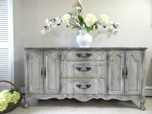
I FAIL TO SEE WHAT SHABY CHICK NEW LOOKS LIKE OLD, HAS TO DO WITH MY WEBSTIE WE ARE IN THE RESEARCH AND DESIGN STAGES OF. IT LEAVES ME TO WONDER, DID YOU REALLY SEE A VALUE HERE? IF YOU DID, YOU DID NOT CONVEY IT TO ME. OR WERE YOU GRASPING AT ANY CONTENT JUST TO FILL THIS REPORT FULL TO THE BRIM? FEEL FREE TO CLARIFY/REMOVE MY CONFUSION.
CSS animations are visual effects that are added to the website for seamless user experience and to add dimension to the website. The majority of selected (and award-winning) websites have this feature, which looks particularly pretty with a minimalist design. Animations create a memorable impression, which is really important. However, these animations are known to underperform and slow down the website loading speed (https://developer.mozilla.org/en-US/docs/Web/CSS/CSS_Animations/Using_CSS_animations ). They need to be made really well to work properly. Here's an example of what you can do: BEFORE YOU TELL ME HOW TO BUILD THEM, MAYBE YOU SHOULD AT LEAST SHOW ME WHAT THEY ARE, WHAT’S THEIR GAIN FOR USING THEM.
https://www.youtube.com/watch?v=KYOYVZcZYAI OK, THIS LINK AT LEAST SHOWED ME WHAT THEY WERE. I THINK THIS LINK SHOULD HAVE PRECEDED THE PREVIOUS LINK. IF USED RIGHT, I THINK THEY CAN ADD A SUBTLE EFFECT, IMPROVEMENT FOR CLARITY. IF USED WRONG, THEY CAN COME ACROSS AS FLASHY AND LOOKING DESPERATE FOR ATTENTION.
WITHOUT SAYING IT IN WORDS, I WANT THE SUM TOTAL OF MY WEBSITE ELEMENTS TO SAY: I SOLVE PROBLEMS WHILE STAYING WITHIN YOUR BUDGET. SEE WHAT I CAN DO FOR YOU! I CAN DO WHAT THE OTHERS CANT. I CAN DO RIGHT WHAT THE OTHERS DO WRONG.
Following are the top designs that match the criteria from least (9) to most (1) suitable:

I’m not a fan of this website visually (graphics and color choice), but the concept is spot-on. The home page is clean and simple, and the animation is really interesting. I love the simplicity of the menu, but the lack of the top/bottom menus/header is obvious. The website is missing content; I believe they went too minimal with the approach. The takeaway is that the website structure, clean home page, and animations are quite unique and worth considering. I MOSTLY AGREE WITH YOU. LET’S TAKE NOTE THAT THIS WEBSITE IS PRESENTING SOMETHING TO US, WHICH MOST OF US ARE NOT FAMILIAR WITH. BEFORE THEY CAN SELL, THEY HAVE TO TEACH. SO BY BEING DIFFERENT THEY CAN LOOK HIGH TECH WHICH CAN MAKE THEM LOOK CREDIBLE. IT MAKES SENSE, A NEW SOLUTION SHOULD BE PRESENTED IN A NEW WAY. AND NOTE: THEY SELL ONE SOLUTION, ONE ITEM ONLY.
THE ANIMATIONS THEY HAD, DID NOTHING FOR ME EXCEPT MAKE THEM LOOK LIKE THEY WANT ATTENTION, WHICH MEANS THEY ARE DESPERATE, WHICH MEANS THEIR SERVICE IS OF LOW VALUE. HOW CAN WE SAY THAT IN REVERSE SO MY WEBSITE/SOLUTIONS LOOK OF HIGH VALUE?
MY WEBSITE DOES NOT HAVE THAT PROBLEM. MY CUSTOMERS ARE FAMILIAR WITH THE SOLUTION THEY NEED BEFORE THEY COME TO MY SITE. THEY FIND MY SITE BECAUSE THEY ARE TRYING TO FIND OUT WHO AVAILABLE CAN DELIVER THEIR SOLUTION TO THEM. MY CHALLENGE IS I SELL/DELIVER 40 ITEMS/DIFFERENT SERVICES. MY CHALLENGE IS HOW CAN MY VISITOR QUICKLY AND EASILY FIND THE SERVICE THAT IS CLOSEST TO THEIR NEED? WITHOUT GETTING BOGGED DOWN IN THE ONES THEY DON’T NEED?
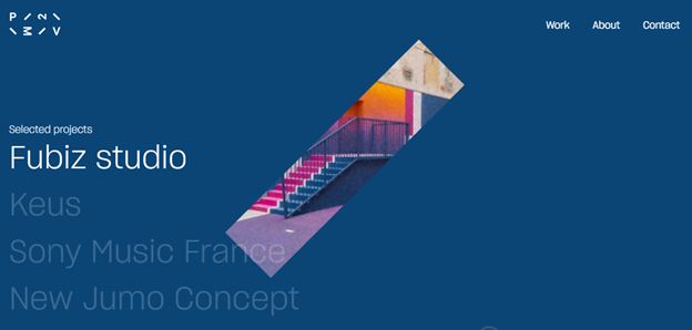
Another highly animated website. There’s an obvious flaw with website performance because it requires high internet speed to load properly, and I question its ability to load well on cell phone data. The contact form on this one is beautiful, on the other hand. However, a simple and clean website with a simple menu leaves enough space to display work samples, create an image slideshow, or even post a video. I’d go with a light background rather than black.
I COULD NOT RELATE TO IT AL ALL.
7) https://holdens.agency/thoughts/

This is a very nice website with a bottom menu button and a video on the home page. Again, it’s easy on the content, but still contains sufficient information. The home page looks very effective as the video says everything about the brand (and it also looks fun). Contact elements are the focus of the website: an entire right sidebar contains contact widgets, and a contact button also appears while navigating through the website.
NOW THIS IS A WEBSITE I LIKED. ACTUALLY MY FAVORITE. WITH THE PICTURES AS AN INDICATOR OF SUBJECT MATTER, I CAN SCROLL VERY QUICKLY TO FIND WHAT INTERESTS ME. IF I’M LOOKING FOR CAKE, AND I SEE A PICTURE OF CAKE, THEN I’LL PAUSE TO READ THE DESCRIPTIVE TITLE/TEXT FOR A LITTLE MORE CLARIFICATION. THIS STYLE SOLVES THE DILEMMA HOW CAN MY CUSTOMERS QUICKLY/EASILY SORT THROUGH MY (extensive) SUBJECT MATTER AND FIND WHAT FITS THEM THE BEST. GOOD WHITE SPACE AND UNCLUTTERED LOOK. GOOD PASTEL COLOR SHADING WITHOUT OVER DOING IT. MAYBE IT COULD STAND FOR A LITTLE MORE COLOR, CHEERFULNESS? I LOVED THEIR DUAL MENU ABILITIES. IT WORKS GOOD ON A COMPUTER AND A CELL PHONE. (yes I tested it) AND THEIR NEXT PAGE FEATURE WAS NOT AS PAINFUL AS MOST OF THEM ARE. MAYBE IT COULD BE USEFUL FOR QUICK PAGE LOADING. This website certainly needs to be re-examined later for deeper consideration. Add it to our favorites list.
6) http://avec-ou-sans.randstad.fr/
This is a one-video website that apparently contains only basic information about the author. This is a possibly risky, but very authentic approach. Can you create a video showcasing your services, capturing your work, (THAT IS ALREADY IN THE WORKS. WE HAVE RESEARCHERS WORKING ON THAT NOW) and then leaving only contact information and basics like business info? If so, this would be a very different approach compared to other websites in your industry. Perhaps you could do this with adding contact buttons and a chat button? IM GLAD YOU FOUND THIS IN THAT WE ARE WILLING TO EXAMINE NEW APPROACHES MAYBE NOT YET POPULARIZED. BUT A LONG ONE VIDEO APPROACH TAKES CONTROL AWAY FROM MY VISITOR TO QUICKLY FIND WHAT RELATES TO THEM, AND TO QUICKLY IGNORE AND GET AWAY FROM WHAT DOES NOT RELATE TO THEM. NOW (optional) A SHORT INTRO VIDEO THAT SHOWS EACH SERVICE FOR 5 SECONDS BEFORE MOVING ON TO THE NEXT, HAS POTENTIAL.
PLUS EACH WEBPAGE WILL HAVE A VIDEO ON IT SPECIFIC TO THAT PAGE/SUBJECT MATTER ONLY.
5) https://www.criticalsoftware.com/

This is an all-in-one home page that uses a clean approach to state the values and offers services. A side-menu looks great, but the tag line needs a smaller font because it takes up too much space. If I imagine the images of your work (or artistic images of sandblasting/welding) instead of theirs, the website would look very appealing. CSS animations remain hard to load, so I’d think about whether or not to use them. A bottom menu, as other desired features (chat, zoom-in, e.t.c) can be added to the website regardless of the theme.
I REALLY LIKE THE SIDE MENU THAT’S ALWAYS VISIBLE, YET WHEN INVOKED, SHOW SUB LAYERS OF DEEPER INFO. THIS SITE NEEDS TO GO IN OUR “LETS EXAMINE CLOSER category” AS WE GET FURTHER ON DOWN THE ROAD OF NARROWING DOWN OUR MUST HAVES.
FOR THE RECORD, I LOVE HOW YOU HAVE A SCREENSHOT FOR A PEEK PREVIEW OF WHAT I MIGHT FIND IN YOUR INFO.
4) https://www.zestbathroomsandkitchens.co.uk/
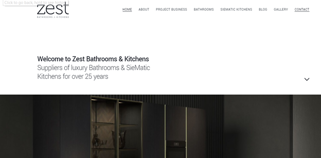
This is an example of a clean, pastel, relaxing theme with the accent on imagery. All required pages are neatly organized in a compact header. There's a lack of contact information and there can also be a search bar and a bottom menu added. IT IS CLEAN AND RELAXING WITH A GOOD FOCUS ON IMAGERY.
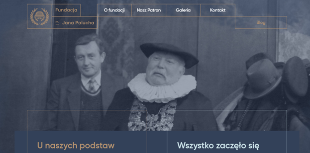
A simple,easy-to-load, image-saturated website. I believe a slideshow of some sort is used here instead of a video, so the website loads smoothly. I don’t understand what they’re about, but the layout with the disappearing header is lovely and enough is shown on the top page. I like that there’s no need to click through the header to find out more because scrolling down the page opens up more content. AND THE HEADER IS SMALL NOT WASTING REAL-ESTATE. Contact info or an e-mail form I believe would need to be someplace visible on your website. AGREED.
2) http://www.wattwiller.com/les-engagements/
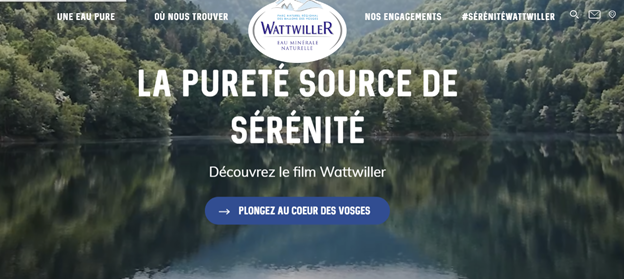
A snippet of a film here is set up to be the homepage background, which I love. Again, a high-quality image is a great replacement. A clean header that takes up almost no space is great, but I don’t appreciate having to load each individual page (there are apparently better ways to arrange that). A search bar and an e-mail button are displayed, but I feel like they should be larger. THIS PAGE HAS THAT “Z” PATTERN YOU REFERRED TO ABOVE. HERE IT WORKS BETTER THAN THE ONE REFERENCED ABOVE. BUT TO MAKE IT WORK, THEIR PICTURES HAVE TO BE SMALLER THAN MINE. SINCE MY PICTURES ARE VERY HIGHLY RELATED TO THE VIEWERS INTERESTS, I WOULD NOT BE WILLING TO MAKE THEM SMALLER TO ACCOMMODATE A Z PATTERN. THEIR LOW CONTRAST TEXT IS A LITTLE CHALLENGING FOR ME TO READ. BUT I LIKED THE SUBTLE COLOR INJECTIONS THEY DID.
http://www.wattwiller.com/experience/wattwiller-la-purete-source-de-serenite/ THIS MAKES ME WONDER… SINCE I AIM TO HAVE A VIDEO ON EACH PAGE, MAYBE I CAN USE THE VIDEO TO DESCRIBE EVERYTHING, INSTEAD OF TEXT AND PICTURES AS I HAVE DONE. AND I LOVED THE RELAXING NATURE BACKGROUND MUSIC TO ADD INFLUENTIAL SUBLIMINAL. SAVE THIS WEBSITE (and notes) IN OUR later examine again category.
1) https://www.lechomat.com/en/

I believe this website design has everything that’s required. The video is used on the home page, but it’s optional. I believe it will look great with a single image as well. The look is clean even though there’s quite a bit of content. Plenty of imagery used, the design of the header is convenient so that the reader doesn’t have to load a new page for every click. You can use a more suitable font (sample 3 looks appropriate), that’s another feature that’s interchangeable. The downside I suspect might be the budget. I THINK IT’S TOO FANCY FOR WHAT I WANT TO PORTRAY. Production and maintenance of the website like this appear to come at a price, so I guess you’ll have to calculate how much it will bring in versus the cost. CHANCES ARE YOU DON’T NEED A BED. THIS WEBSITE WANTS TO SELL YOU A VERY EXPENSIVE BED. TO MAKE YOU SPEND A LOT OF MONEY ON SOMETHING YOU DON’T NEED, THEY HAVE TO MAKE IT LIKE A DREAM EXPERIENCE. A FANTASY COME TRUE. AND THE DESIGN OF THIS WEBSITE CONVINCES YOU THE BEDS ARE VERY EXPENSIVE. EXTRAVAGANT EVEN. I THINK I’M ONE STEP SHY OF THAT POINT FOR MY BUSINESS. MINE IS CLOSER TO, you know high quality work is going to come with a premium price. MINE IS NOT, buy this and you’ll have what your neighbors can’t afford.
I HAVE A BIG ADVANTAGE. YOUR blank IS BROKE AND YOU NEED IT FIXED. NOT FIXING IT IS NOT An OPTION. YOU NEED WHAT I HAVE. IT’S NOT A UPSELL OR LUXURY. THE ONLY REAL QUESTION AT HAND IS, IS MY SERVICE A PRECISE FIT FOR YOUR NEED? THAT’S WHY I NEED SO MANY PAGES & PICTURES SHOWING THE DIFFERENT VARIATIONS OF WHAT I DO. A SHOE FOR EVERY SIZE.
Based on the analysis of the good web design examples and cross-comparing with the demands of your industry, I find the following to be the most important with your design:
· A direct call to action. If your goal is to get the prospect to call, then you should make that a focus of your website. Whichever widget you choose, be it chat, e-mail form, or a phone call, I believe it should be the accent, the focus of the design. Here's an example:
https://cdn.dribbble.com/users/1063591/screenshots/5422522/call_to_action_2x.png
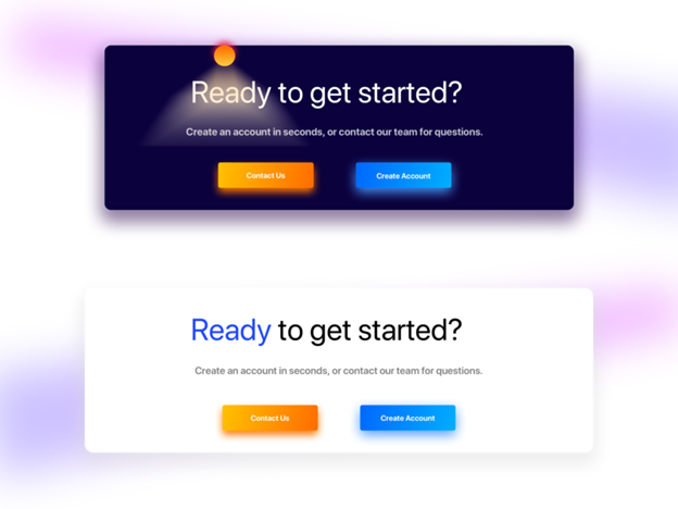
CALL TO ACTION? THANK YOU BUT NO THANK YOU. Herd mentatlity, do it because everyone else is doing it?
IF YOUR SITTING ON THE FENCE UNDECIDED, AND YOU CANT COME OVER TO MY SIDE UNLESS I NUDGE YOU, THEN YOU REALLY DID NOT NEED MY SERVICES VERY MUCH: TRANSLATION; YOU HAVE VERY LITTLE MONEY. TRANSLATION; YOU’RE A WASTE OF MY TIME.
CALL TO ACTION: TRANSLATION; I’M DESPERATE AND I NEED YOUR MONEY. I CANT MAKE IT WITHOUT YOU SO PLESE HELP ME BECAUSE IM WILLING TO BEG and I hope your not smart enough to recognize it.
CALL TO ACTION: TRANSLATION; I’M GREEDY AND I’L STOP AT NOTHING TO TALK YOU OUT OF YOUR MONEY.
The road less traveled. Find my phone number and call me if it suits you. Translation; I don’t need your work so don’t expect me to come in with bargain basement prices, because I won’t. I won’t jump through hoops to get your job, and I REALLY wont.
NOW THAT DOESN’T MEAN I’M GOING TO HIDE MY PH #. BUT I WONT BEG YOU TO CALL.
· Killer Home page. I got these design examples from brands that are high-profile and don't need to chase after customers/clients. Their goal is to work only with high-budget clients. NOW YOU’RE TALKING MY LANGUAGE. That means that their home pages are designed to inspire creative collaborations regardless of the cost. Some use images, others go for videos or slide shows. Either way, the result is that the visitor becomes inspired to take action. INSPIRED WITHOUT BEING BEGGED. YES, THAT’S MY STYLE. The home page inspires creativity and interest, and with that mindset, everything else is less relevant. I DON’T KNOW THAT I BUY INTO THAT.
According to my analytics, when most people come to my site, they go to the page that google sent them too, related to their search terms, which means they come to a specific landing page with specific content related to their specific search terms.
If you want to learn how to bake chocolate cake covered in cherry sauce, google won’t take you to my bakery/homepage, google will take you to my chocolate cake and cherry landing page. And from there you will get the info you want and make your decision/take your action. From a specific landing page, only 20% of the viewers will browse on over to my homepage. HOWEVER my home page does have a lot of room for improvement and its time I update it on the new website we are designing.
·
· This article https://www.invespcro.com/blog/a-step-by-step-guide-to-turn-your-homepage-into-high-conversion-machine/ explains the importance of the home page. It needs to be informative, but also simple and memorable. In the examples I've shown, the owners go for minimal wording for a direct message, and visual to send other important messages. UPON READING THIS FURTHER, IT DOES MAKE ME WONDER IF IT NEEDS TO READ IN MORE CAREFUL DETAIL. I’M WILLING TO ADMIT, MAYBE MY VIEW POINT OVER SIMPLIFIES ITS. MAYBE I’M MISSING QUITE A BIT. I THINK I WILL LET YOU RESEARCH IT, AND THEN LET YOU DESIGN MY HOMEPAGE. I WILL LEAVE IT TO YOU.
· A clean, simple menu/header. I believe that your best choice is a minimalist header, like this one: SMALLER THE BETTER.
While hidden menus look great, I don't think you can count on your customer base to be THAT tech-savvy. I’M AFRAID I AGREE WITH YOU. 30% OF MY CUSTOMERS TEXT ME PICTURES BECAUSE THEY CANT EMAIL THEM AND DON’T KNOW WHAT THE DIFFERENCE IS.
· Homepage background. While I don't see anything wrong with a plain one-colored background, you'll stand out if you go for a background image or a video. Here's a sample of a home page with a call to action:
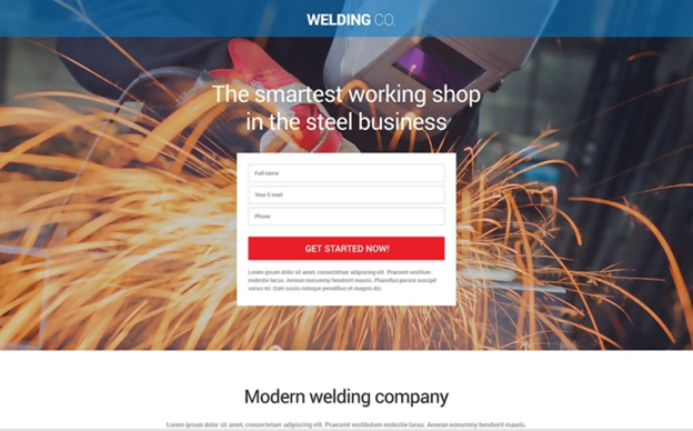
A PROPER IMAGE BACKGROUND HAS POTENTIAL IF DONE RIGHT, OR PROBLEMS IF DONE SLOPPY. I WOULD NEED TO SEE OUR SPECIFIC OPTIONS WE ARE CONSIDERING AND DECIDE ON, ON A ONE BY ONE BASIS.
The websites with a high-quality background image look great, and they’re easiest to load. Slide shows/galleries also load well and are visually appealing. I’M NOT TOO INTERESTED IN PICTURES WITHOUT EXPLANATIONS OF WHAT’S GOING ON. I PREFER MY PICTURES TO BE INLINE VERTICALLY WITH A PAGE AND TEXT DISPERSED THROUGH OUT TELLING A STORY.
LOOK AT THIS PAGE. http://after-hours-welding.com/pages/welding/aluminum_tig-mig_welding_hot_water_heater.html IMAGINE THE PICTURES BEING IN A SLIDESHOW GALLERY WITH NO EXPLANATIONS. NOW IMAGINE ALL THE TEXT BEING ON ONE PAGE WITH NO PICTURES.
NEITHER OPTION WORKS FOR ME.
WHAT IS BOUNCE RATE? WHAT DOES IT DO TO ONES GOOGLE ORGANIC SEARCH RESULTS? HOW DO YOU LOWER YOUR BOUNCE RATE?
GOOGLE CAN TELL HOW LONG YOU STAYED ON MY PAGE AND READ IT. THE LONGER YOU STAY, THE MORE YOU CONVINCE GOOGLE YOU LOVE MY CONTENT. TRANSLATION; THE SEARCH RESULTS GOOGLE DELIVERED WHERE WHAT YOU WANTED TO SEE. TRANSLATION; THEREFORE YOUR MORE LIKELY TO USE GOOGLE SEARCH AGAIN IN THE FUTURE. TRANSLATION; YOU INCREASE THE LIKELY HOOD GOOGLE CAN MAKE SOME ADVERTISING MONEY OFF YOU SOMETIME IN THE FUTURE.
GOOGLE NEEDS TO SURVIVE, AND AIMS ON DOING THAT BY BEING A SEARCH ENGINE THAT BRINGS YOU SEARCH RESULTS YOU LIKE. HOW DOES GOOGLE KNOW IF YOU LIKED THE SEARCH RESULTS IT GAVE TO YOU? BY HOW LONG YOU STAY AND READ IT.
THE PAGES YOU READ FOR 20 SECONDS OR LESS, GOOGLE WILL PUSH WAY DOWN IN THE SEARCH RESULTS. THE PAGES YOU READ FOR MINUTES OR MORE, GOOGLE WILL PULL UP TO THE TOP OF SEARCH RESULTS.
DO YOU THINK I WANT TO BE AT THE TOP OF THE PAGE, OR WAY DOWN 5 PAGES DEEP?
HOW DO I CONVINCE GOOGLE TO PUT ME AT THE TOP?
IF YOU’RE INTERESTED IN ALUMINUM BOAT WELDING, http://after-hours-welding.com/pages/welding/welding_fabricating_aluminum_bowfishing_platforms.html THEN MY PAGES WITH LOTS OF PICTURES AND SHORT BUT SWEET EXPLANATIONS, WILL HOLD YOUR ATTENTION WHILE YOU SPEND 5 MINUTES OR MORE READING IT. I WANT A LONG PAGE. I WANT A LOT OF PICTURES ON THAT PAGE. I WANT HIGHLY RELEVANT TEXT DESCRIPTIONS ON THAT PAGE THAT HOLD YOUR INTEREST AND TELL YOU THE STORY THAT FASCINATES YOU TO THE END.
I WANT GOOGLE TO KNOW YOU’VE SPENT A LOT OF TIME READING MY PAGE WITHOUT CLICKING AWAY TO SOME OTHER URL.
I HAVE A AMAZING RECIPE THAT WORKS, EXCEPT THESE DAYS I’M LOOSING A LOT OF POINTS FOR MY OLD WEBSITE NOT BEING RESPONSIVE, NOT LOOKING GOOD IN CELL PHONES. SO NEW WEBSITE TIME. BUT WE KEEP THE RECIPE THAT WORKS. NO GALLERIES OR SLIDESHOWS. THAT’S HERD MENTALITY AND I’M NOT GOING TO CHASE THE BRAINLESS.
Background videos have the strongest impact, but can be a real pain when it comes to loading (particularly from a cell phone). I HAVE ANOTHER FREELANCER RESEARCHING THAT CURRENTLY. AND I’M CONSIDERING PUTTING YOU ON THAT RESEARCH PROJECT ALSO.
YOU KNOW I LOVE A LONG PAGE WITH LOTS OF PICTURES AND GREAT EXPLANATIONS OF WHAT’S GOING ON. I’M ALSO AIMING AT HAVING EMBEDDED YOUTUBE VIDEO ON THE SAME PAGE, EXPLAINING THE SAME THING, BUT SO PEOPLE CAN WATCH INSTEAD OF READ. IT GIVES THE VISITOR THE OPTION TO WATCH OR READ, OR BOTH WHILE ON THE SAME PAGE. AND GOOGLE CAN TELL IF THEY STAYED AND WATCHED THE WHOLE VIDEO, OR QUICKLY LEFT.
· A clean, polished look. AGREED Not only in terms of web design but also the quality images you intend on using. High resolution is a must and also working with a photo editor to adjust elements that have a subliminal impact on the observer (brightness, hue, contrast, saturation, texture, etc.) HIGH RESOLUTION IS A VAGUE DEFINITION. DEFINE THAT WITH MORE CLARITY AS IF YOU’RE INSTRUCTING SOMEONE HOW TO HANDLE MY RAW IMAGES FROM MY CAMERA BEFORE THEY PUT THEM ON THE NEW WEBSITE.
· This article: https://www.huffpost.com/entry/photography-and-psychology-part-1_b_4380400 says a lot about subliminal messages that an image can send. I'm normally about maximizing everything you invest in and giving 100% to achieve 200%. I believe that, with proper photo editing, you can achieve to spark interest in every website visitor. You want them to want to weld and sandblast not only their truck but also their car, neighbor's cat, their wife, and their grandmother. YOU MAKE ME LAUGH. I WANT THE NEIGHBORS WIFE. I’M A SINGLE BACHELOR.
· 98% OF MY CUSTOMERS ARE MALE. IS THERE SOMETHING SEXY YET SUBTLE WE CAN DO WITH MY NEW WEBSITE TO EXCITE THE MALE SPECIES?
Here's an example of a high-quality welding image:

https://www.brookhavencollege.edu/cd/ce/cepgms/Welding/publishingimages/welding-464x464.jpg

I DO LIKE THE ARTISTIC PICTURES. BUT IT TAKES A LOT OF EFFORT AND TIME TO PRODUCE THEM. AND THEN WHAT IS THE EXTRA GAIN FOR THAT TIME AND EFFORT?
EXPECT WE’LL HAVE LOTS OF PICTUES LIKE THE ONES YOU SEE ON MY SITE. WE’LL MAKE UP IN QUANTITY FOR WHAT WE LACK IN SPECTACULAR. WE CAN CONTROL THE SIZE AND THEY ARE ALL HIGH RESOLUTION ORIGINALS. BUT THEY WILL ALWAYS BE A PICTURE OF A REAL JOB IN MOTION AS ITS HAPPENING, AS OUR PRIMARY FOCUS IS ON COMPLETING THE JOB, AND 2NDARY IS GRABBING A FEW PHOTOS WHILE WE ARE AT IT.
versus the common ones on others' websites:
https://greatwelds.com/wp-content/uploads/2013/04/welding.jpg
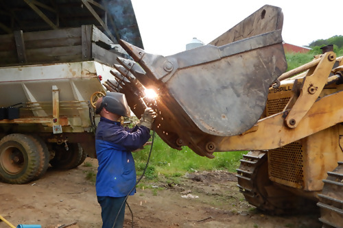
And here's an example of what you can do if you want to combine traditional with out-of-the-box:
https://i.pinimg.com/236x/7c/58/d7/7c58d7078767d4303b98cafba22ac2b7--welding.jpg?b=t

· To animate or not to animate? CSS animations look stunning, but I believe you'll have to work out something with your designer/developer to avoid slowing down the website. A bit of motion on the website looks great, but the websites with simpler animations load better. THE MOTION HAS TO BE SUBTLE SO THE SITE DOES NOT ATTEMPT TO LOOK FLASHY OR BEGGING FOR ATTENTION.
· Widgets (navigation, zoom-in, contact forms, phone calls, etc.) are separate from the website design and can be added and removed. I DON’T KNOW MUCH ABOUT THAT AND NEED TO LEARN WHAT OPTIONS EXIST TO SELECT FROM.
· Bottom menu: I came across only two websites that have a bottom menu built in, but that’s also a feature you can ask your developer to install regardless of chosen theme and design.
· Colors: Most of the top websites have a white background to accent high-quality images, with a light pastel color theme. I’M OK WITH THAT.
· The message: The importance of subliminal messages on a website is well-explained here: https://www.mdirector.com/en/digital-marketing/examples-marketing-subliminal-messages.html
What matters here to you is that I discovered that the brands use a direct and a hidden way to send two different messages to the user:
1. 'It's all about you.' Directly, through content design, high-value brands position themselves as being all about the client.
2. 'We don't need you, you need us.' This subliminal message is spread across the visual elements and the lack of advertising. Visual is used to display the brand's value and worth (quality of performance, equipment, finished product), while the lack of '$' on their website sends a message that they don't need to chase after anyone. 'We want to serve you, but we'll do just fine without you. If you don't hire us, you lose.’ THAT IS MY AIM. AND MY TRUE FEELINGS.
When analyzing the examples of top-notch minimalist websites, it becomes obvious that the design (clean structure, visual highlight) is used to showcase the brand value and worth (without using words). When advertising quality services, simply stating that your services are 'high-quality' isn't enough. Anyone can say that. Showcasing testimonials and visual proof of your work appears more important than talking about it. Creative web designers rely on the visual appeal to do this, and they tweak their graphics to enhance the subconscious effect. SO, IF YOU WERE IN CHARGE OF DIRECTING MY WEB DESIGNER, WHAT WOULD YOU DIRECT THEM TO DO?
Content-wise, finding the middle ground between 'less is more' and 'not enough' depends on your knowledge of your consumers. MY CUSTOMERS NEED TO KNOW ONE THING, HAVE I DONE THAT TYPE OF WORK BEFORE? AND WHATS MY PH #? 90% OF MY CUSTOMERS ARE BETWEEN 30-65 YEARS OLD. How much they need to know? MY CUSTOMERS HAVE A PROBLEM, I HAVE A SOLUTION. IT’ PRICEY, BUT I WONT LIE OR TRICK YOU OUT OF YOUR MONEY. I DO WHAT I SAY I WILL DO. What's relevant to them, and what's not? MY COMPETITION TELLS TEXT STORIES OF WHAT THEY CLAIM THEY CAN DO. I SHOW PICTURE STORIES OF WHAT I HAVE DONE. I MAKE NO CLAIMS OF WHAT I CAN DO, I SHOW WHAT I HAVE DONE. I find that the vast majority of service providers' websites tend to go overboard with the content, aiming to be informative and transparent. I AM TOYING WITH THE IDEA, OF SOME (10 SECOND LONG TIMED) BANNER AT THE TOP THAT SAYS, “I DON’T PUT COOKIES OR OTHER SPY TRASH ON YOUR COMPUTER. SORRY Nabisco, NO COOKIES ON THIS WEBSITE” WHAT DO YOU THINK? WHAT IS THE SUBLIMINAL HERE? HOW MANY MESSAGES DOES THAT STATEMENT SEND? Think about whether or not this approach serves your goal of converting. Moreover, there's not a lot of originality I LOVE ORIGINALITY WITHOUT BEING FLASHY OR DESPERATE LOOKING and variety in describing technical processes from a writer's perspective. AGREED. THE PICTURE STORY SAYS WHAT THE PICTURE STORY IS. THERE’S NO NEED FOR MORE OR LESS THAN THAT. MORE OR LESS THAN THAT BEGINS TO DETRACT FROM MY PURPOSE. The content often lacks creativity and authenticity despite being plagiarism-free. As a result, most websites within a specific field end up looking alike. THIS I WOULD LIKE TO AVOID BY BEING DIFFERENT IN NON OFFENSIVE WAYS. MOST CORPORATE WEBSITES ARE SO STERILIZED, THERE IS NO PERSONALITY, NO CHARACTER FROM A REAL INDIVIDUAL. NO HUMOR. I LOVED IT WHEN YOU TALKED ABOUT SANDBLASTING THE CAT, NEIGHBOR, AND GRANDMA. YOU STOPPED BEING SCARED OF LETTING THE REAL YOU SHOW THROUGH. LETS FIND A COMEDIAN TO SPICE UP THE SITE, OR AT LEAST, MY CONTENT. HEY RED, DO A SEARCH ON FUNNY WEBSITES. WHAT NON OFFENSIVE SPICE CAN WE FIND THAT MAKES US CLEARLY A BIT DIFFERENT THAN THE OTHER SCARDY CATS?
With a goal to stand out in mind, the main difference between others' websites and the top examples is not trying to 'get' the customer, but showcasing worth (not only values) instead. AH, I SEE YOU DO UNDERSTAND ME. GOOD. With that in mind, menus and pages are carefully structured to bridge the gap between the brand and the client. First and foremost, testimonials, work samples, and contact information are (n)one or two clicks away. NONE CLICKS AWAY.
Actually I think you found my favorite website. NONE CLICKS AWAY. WHY A HOME PAGE? BECAUSE EVERYONE ELSE DOES IT? HERD MENTALITY? MY ANALYTICS SHOWS GOOGLE FREQUENTLY SHOWS TO THE SEARCHER THE PAGE MOST RELEVANT TO THEIR QUERY. IF YOUR ENGINE BLOCK HAS A CRACK IN IT, YOU’D MOST LIKELY SEARCH FOR CAST IRON WELDING SINCE YOUR ENGINE BLOCK IS MADE FROM CAST IRON. I HAVE A LANDING PAGE FOR CAST IRON WELDING. This is the page google would show you, NOT MY HOME PAGE WHICH DOES NOT TALK ABOUT ENGINE BLOCKS OR CAST IRON WELDING. GOOGLE WOULD TAKE YOU DIRECTLY TO MY LANDING PAGE WHICH IS FOCUSED ON ONLY CAST IRON WELDING. NOW I DON’T KNOW IF GOOGLE WILL SHOW YOU THE SAME PAGE IT SHOWED ME. BUT THE PAGE IT SHOWED ME WAS ON A NATIONAL COMPETITION MEANING I DID NOT ADD A CITY OR STATE TO THE SEARCH TERMS. SO I COMPETED AGAINST EVERYONE IN THE NATION. WITH THIS SAID, MY PAGE FOR CAST IRON WELDING SHOWED UP IN 4TH PLACE FROM THE TOP ON THE FIRST PAGE, NOT COUNTING THE VIDEOS OFFERED.
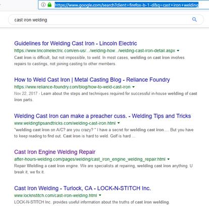
SO YOU THE SEARCHER CLICKS ON IT AND GOES DIRECTLY TO MY LANDING PAGE, NOT MY HOME PAGE. http://after-hours-welding.com/pages/welding/cast_iron_engine_welding_repair.html YOU HAVE A PROBLEM, YOUR CAST IRON ENGINE BLOCK IS CRACKED. I HAVE A PAGE SHOWING I AM THE SOLUTION PROVIDER FOR YOUR PROBLEM. GAME OVER. YOU NEED TO KNOW NOTHING ELSE. YOU CALL ME. HOME PAGE NEVER INVOLVED.
SO WHAT IS THE VALUE OF A HOME PAGE TO ME. NONE CLICKS AWAY. STUFF THAT MOST PEOPLE PUT ON THEIR HOME PAGE, WE CAN PUT ON OUR ABOUT PAGE OR OUT MISSION STATEMENT PAGE. Remember my favorite website? I WANT TWO COLUMNS OF PICTURES AND DESCRIPTIONS ON IT SHOW CASING EACH JOB I HAVE DONE. NONE CLICKS AWAY. CURRENTLY FOR A VISITOR TO FIND THAT INFO, THAT HAPPENS TO BE ON MY HOMEPAGE FOR WHATEVER REASON, HAS TO CLICK TO GET ON THIS PAGE (1 CLICK MORE) http://after-hours-welding.com/pages/welding/types_of_welding_we_do.html THEN THEY CAN SCROLL MY JOB HISTORY.
LETS BE DIFFERENT AND IT WONT OFFEND ANYONE. LETS PUT MY JOB HISTORY ON THE HOME PAGE. THAT’S WHAT PEOPLE REALLY WANT TO SEE.
AND LETS NOTE: WHAT PUT MY LANDING PAGE ON GOOGLES FIRST PAGE OF RESULTS 4TH FROM THE TOP? BECAUSE I HAD A LOT OF PICTURES AND RELEVANT TEXT DESCRIPTION BROKEN INTO MANY SMALL PIECES THAT WERE EASY TO READ, AND CAPTURED AND HELD THE READERS ATTENTION FOR 10 MINUTES OR MORE. SEO THAT WORKS. HOW MUCH OF THAT CAST IRON WELDING PAGE OF MINE DID YOU ACTUALLY READ? HOW LONG DID YOU STAY ON IT?
Second, the main purpose of the content is to show (directly and unconsciously) how the service/product solves problems or fulfills a need. Accessibility is the top priority. Last, but not the least, tiny little tweaks such as CSS animations have a role in making the website (and brand) memorable. If your website is fun, the visitor will remember you. BEING REMEMBERED IS NOT MY GOAL. IF MY SOLUTION FITS THEIR PROBLEM (meaning they will spend money to hire me), GET THEM TO CALL ME IS MY GOAL. OTHERWISE I REALLY DON’T WANT TO HEAR FROM THEM. IF CSS ANIMATION HELPS THEM STAY ON MY PAGE LONGER SO MY BOUNCE RATE IS REDUCED FURTHER, THEN CSS ALSO CAN BE A GOAL. WE NEED TO HAVE A HIERARCHY OF PRIORITIES WELL UNDERSTOOD AND DOCUMENTED. WE CANT LET A PRIORITY OF LOWER VALUE GET IN THE WAY OF IMPLEMENTING A PRIORITY OF HIGHER VALUE. PLEASE UNDERSTAND THIS CLEARLY.
My final conclusion is that, while they're plenty of simple ways to make a killer website for your specific needs, you'll need to weigh in the costs and the strain that extra components might put on website performance. Even with the best design, your website will fail if it takes ages for your average customer to load it on their desktop. I DON’T NEED FANCY AND SLOW. GOOD CONTENT, CLEAN, ATTRACTIVE, EASY AND FAST TO NAVIGATE WITH SIMPLE PLEASING COLORS.
I LOVED YOUR RESEARCH AND REPORT. I FEEL I GOT MY $50 WORTH. I FEEL YOU’RE WORTH HIRING AGAIN IF YOU WILL GIVE ME THE SAME LEVEL OF ATTENTION TO DETAIL AND THOROUGHNESS YOU GAVE ME HERE.
AS YOU CAN SEE, I WENT THROUGH IT THOROUGHLY AND NOTED WHAT WAS VALUABLE AND MOST IMPORTANT TO ME, AND WHY I THOUGHT IT WAS IMPORTANT.
NOW PRETEND IT IS YOUR JOB TO HAND A SET OF WRITTEN INSTRUCTIONS TO THE CONTENT CREATOR AND WEB DESIGNER. IT YOUR JOB TO DIRECT THEM WITH THE INSTRUCTIONS YOU’RE GIVING THEM.
BASED ON THE INFO HERE THAT I AGREE WITH, MAKE SET OF INSTRUCTIONS GUIDING THE NEXT PERSON ON HOW TO IMPLEMENT OUR WISHES.
AND PRIORITIZE IT, NOTING WHAT IS MOST VALUABLE, AND THEN NEXT MOST VALUABLE AND SO ON DOWN THE LINE UNTIL IT’S LAST GUIDE IS WHAT’S LEAST VALUABLE BUT STILL WORTHY TO KEEP.
PRETEND THE USER OF THESE INSTRUCTIONS WON’T GET TO ASK YOU QUESTIONS, SO MAKE IT CLEAR AND SHORT AS POSSIBLE WITHOUT MAKING IT TOO VAGUE/AMBIGUOUS.
THIS REPORT WAS YOU SELLING ME ON YOUR FINDINGS AND OPINIONS SO DEEP AND LONG WAS VALUABLE. ESPECIALLY FOR CONSIDERING AND EVALUATING.
BUT THE INSTRUCTIONS YOU CREATE FROM THIS REPORT IS NOT SELLING, NOT NEGOTIABLE, NOT TO CONVINCE THEM, BUT INSTRUCT THEM.
DEFINITELY TAKE LINKS AND EXAMPLES FROM THIS REPORT AND INCLUDE THEM IN THE INSTRUCTIONS SO THE USER CAN CLEARLY SEE WHAT THEY ARE TO DO. LEAVE NO ROOM FOR DOUBT. BUT SHORT AND SUCCINCT AS POSSIBLE.
THE INSTRUCTIONS YOU WRITE FOR MAKING A CLEAN WEBSITE, AND A FEW SEO TIPS I MENTIONED, WILL PAY $40.
THE FEW QUESTIONS I ASKED YOU ABOUT THIS REPORT, ANSWER THEM SEPARATE FROM THE INSTRUCTIONS AND SHOOT THEM TO ME AND TELL ME HOW MUCH I OWE YOU.
ANOTHER PROJECT I’M CONSIDERING YOU FOR, IS RECORDING SOME AUDIO FROM SOME RESEARCH YOU WILL DO. I DON’T KNOW HOW WELL YOU SPEAK ENGLISH. YOU WRITE IT VERY WELL.
I WOULD LIKE YOU TO RECORD YOUR VOICE FOR 5 MINUTES. YOU DON’T NEED TO RESEARCH ANYTHING FIRST. THIS IS JUST SO I CAN DETERMINE HOW WELL I UNDERSTAND YOUR SPEECH. THE SUBJECT MATTER YOU CAN SPEAK ABOUT, IS TO RELAX SOMEONE AND HELP THEM SLEEP.
IF I CAN UNDERSTAND YOUR VOICE WELL AND LIKE IT, THEN I’LL SEND YOU ANOTHER RESEARCH EXPEDITION AND EVENTUALLY YOU WILL RECORD IT WITH YOUR VOICE. IF YOUR VOICE IS NOT SUITABLE, I MAY WELL HAVE YOU DO THE RESEARCH ANYHOW, AND GET SOMEONE ELSE TO RECORD IT.
THIS 5 MINUTE TEST RECORDING WILL PAY $10. WHEN YOU TURN IT IN, I’LL PAY YOU IN A $10 BONUS. MAKE A .MP3 OR .WAV FILE.
ASIDE FROM THESE, I HAVE OTHER RESEARCH AND REPORTS FOR YOU TO DO, WHICH I WILL TELL YOU ABOUT SOON, AS I DON’T HAVE TIME TODAY.
YOU TOOK A CHANCE. YOU MADE A $50 REPORT IN HOPES THAT I WOULD LIKE/APPRECIATE IT. I DID, YOU GOT PAID $60 FOR IT. I LOVE THAT YOU TOOK THE INITIATIVE. THAT CONVINCES ME YOU’RE ON MY SIDE.
OF MY 4 FREELANCERS I KEPT FROM THE PREVIOUS TESTING OUT OF 12 APPLICANTS, YOU HAVE MOVED YOURSELF TO THE HIGHEST RANKED POSITION. YOU SHOWED ME YOU WILL DO MORE THAN THE OTHERS FOR THE MONEY. YOU BID HIGHER THAN THEY DID. IF YOU KEEP THIS UP I’M WILLING TO KEEP YOU AS BUSY AS YOU WISH FOR, AS BUSY AS I HAVE TIME TO SPARE TO INSTRUCT YOU.
BUY THE WAY, THE NEW WEBSITE WON’T BE ABOUT WELDING. IT WILL BE ALL ABOUT SANDBLASTING AS THIS IS THE TYPE OF WORK I WANT MORE OF.
THANK YOU FOR YOUR TREMENDOUS EFFORT. I WAS VERY IMPRESSED.
CHRIS
Bojana Veselinovic 3rd REPORT turned in-TOP 9 CLEAN WEBSITE IDEAS.doc
This is a website design plan for Chris Van's After Hours Welding and Sandblasting website. The website aims towards straight-point, minimalist design that displays the essence and benefits of services aiming to attract high-budget clients. The target audience are adults between age 30 and 65 with urgent needs for heavy welding and sandblasting services. The goal is to target high-value projects and convert to appointments. The visual aesthetic of the website is clean and minimal with masculine pastel colors used to display effectiveness and reliability, but also to relax visitors who are in a state of distress due to unforeseen damage and pending costly repairs. The website uses quality images to establish an emotional connection with the visitor combined with the optimum amount of on-point, informative content.
The goal of this design is to stand out from the competition but stay close to the target audience. Common design errors in the industry include flashy banners, uncoordinated colors, and too much content and chasing customers by advertising low prices. The client aims to stand out by not discussing money on the website but focusing on quality service using images.
Messages:
1. 'It's all about you.' Directly, through content design, the client positions himself as a high-value service provider who is all about serving the client.
2. 'We don't need you, you need us.' Website should feature images displaying the size of the brand and history as well as their acclaimed position in the industry.
Suggestions:
Visual proof of value: Create a TESTIMONIALS gallery with customer testimonials, customer photos with testimonials or portfolio photos showcasing highest-value work samples. The accent is on high-resolution images of LARGE projects, preferably showing faces of the workers with pleasant facial expressions (calm or smiling).
Target audience: High-budget sandblasting and welding customers and commercial clientele; Readers in emotional distress and state of urgency. Between 30-65 years.
Website tone: Pleasant, relaxing, suiting background colors (secondary pages and onwards) with contrasting warm, masculine colors to display competence, authority, and protective attitude (landing page, header).
Goals:
1. Relax customers who are contacting in a state of an emergency (make them feel safe, ''Your problem is solvable";
2. Attract high-budget clients and larger projects. Use images and informative content of large-scale work.
3. Convert to phone calls and appointments. Using value proposition on the landing page, define the customer's journey from distress and panic to having their decaying essentials (car, truck, home, boat, etc.) restored to full functionality. Offer a 'free estimation' button with a contact form and/or offer contact information to schedule appointments.
General examples:
http://avec-ou-sans.randstad.fr/
http://www.wattwiller.com/les-engagements/
Landscape: The website advertises welding and sandblasting services with the accent being on sandblasting; Calm, soothing background with the accent on visual and quality images that showcase results.
Use photos to reduce bounce rate: photos relevant to keyword search with SEO-friendly descriptions that provide the exact answer to the search query. Optimize images with WordPress plugins (large images slow down the website). Source: https://neilpatel.com/blog/13-ways-to-reduce-bounce-rate-and-increase-your-conversions/.
Example of an image layout with descriptions:
https://images.app.goo.gl/1wPsZnrqAqFYG64s9
Instructions: Plenty of white space between images for visibility and resting space. Image descriptions by bullet points defining services. Text alignment different across images (left, right, center) for versatility and visual appeal.
Color Scheme Suggestions:
Soft, warm, deep-colored header with light pastel blues and greens for other elements. White background for all pages aside from the home page.
Theme suggestion:
https://images.app.goo.gl/fJuBdsf1BCUHScrD8
Suggestion: Home page header blends with the background, only page names are visible. Other pages feature a dark blue header with a mint (or light brown) drop-down menu. Images with descriptions as mentioned leading to pages for the service in question. Optionally, header colors might change with different pages (e.g minimal on the home/landing page, dark blue on main pages, mint green on subpages etc.).
Tone: Friendly formal. An effective search bar that helps prospects search by keywords; Clean and simple header (white letters). High-quality background video or image;
Image layout for service-related websites: Clean, medium-sized images with descriptions for secondary pages. Example: https://colorlib.com/wp/wp-content/uploads/sites/2/art-gallery-website-template.jpg
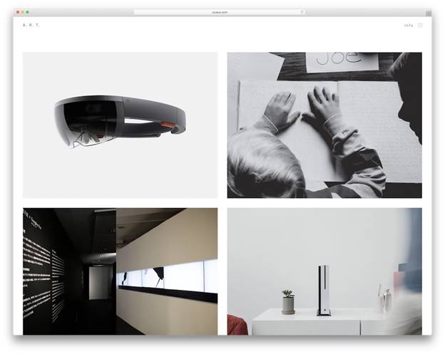
Images used should benefit the reader by educating on the process and showcasing the best results. Informative photos that display workers in action, smiling. Worker’s faces should be visible to establish an emotional connection and trust. Consider obtaining images showcasing satisfied customers.
Before-After (benefit, quality of service): https://www.shutterstock.com/image-photo/before-after-sandblasting-employee-prepares-metal-1217153713?src=ptcTqs3Ft22XyZMzbGdXxg-1-81

A photo example of a heavy-duty, high budget project: https://www.shutterstock.com/image-photo/workers-health-safety-sandblasting-many-abrasives-1352938367?src=ptcTqs3Ft22XyZMzbGdXxg-1-98

Used to present a particular service, a presentation of a large-scale project implies high budget and cost while focusing on the quality of a result. A close-up is also a good alternative:


Warm hues of this image present a high-value project that shifts focus away from dread and cost to the final result and ultimate benefits. The tone of the image is relaxing, which also helps suite the customer down and open their mind for dialog.

An image that displays detailed work on a complex piece displays reliability, authority, and experience. The customer will trust that good work will be done regardless of the complexity of their project.

Emotional connection established through soft and effective body language while the surface displays the quality of work.
Client's source images will be used for the website, but here are some good examples for reference:
https://www.shutterstock.com/search/car+sandblasting
Skill, experience, friendliness, reliability displayed through a calm facial expression and carrying hand gesture: https://www.shutterstock.com/image-photo/industrial-manufacture-factory-production-heavy-pellet-499662412?src=ptcTqs3Ft22XyZMzbGdXxg-1-85

More quality sandblasting images at https://www.shutterstock.com/search/sandblasting
Descriptions and explanations as on page: http://after-hours-welding.com/pages/welding/aluminum_tig-mig_welding_hot_water_heater.html
Make sure to optimize image size for faster loading and to reduce bounce rate.
Images used to send subliminal messages of trust, reliability, and authority as described here: https://www.mdirector.com/en/digital-marketing/examples-marketing-subliminal-messages.html
Aesthetics – Pastel minimalism
A relaxing tone is a must, without strong contrasts. A theme is a backdrop to highlight imagery. An artistic approach to the design is the key to stand out from typical service-provider websites.
Homepage: full background image/video.
Page instructions: plenty of white space with margins, white background. Secondary pages: right alignment; Tertiary pages: centered text. Text type: plenty of white space between letters and lines (leading and kerning) for commercial websites adjusted for highest visual appeal and readability.
Images: High-resolution, detailed description
Example: https://www.istockphoto.com/photos/sandblasting?sort=mostpopular&mediatype=photography&phrase=sandblasting
Videos: made/provided by the client;
General concept: quality background video, white letters, centered drop-down top menu, bottom navigation bar;
Header and layout example:
https://holdens.agency/thoughts/
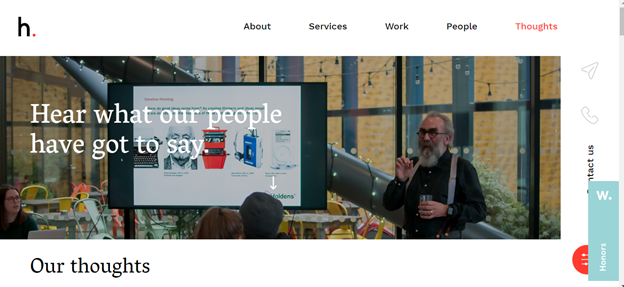
Simple, clean, small header Right or left disappearing side menu with contact buttons. Text highlighted when hovering over.
http://avec-ou-sans.randstad.fr/

High-quality background image or video.
Consider creating a landing page with a short, 5-second background video. Essential information displayed in the center with a ‘Free estimate’ button underneath.
https://www.criticalsoftware.com/
Side menu as seen on this website (screenshot):

Example http://www.wattwiller.com/les-engagements/

Drive high-budget prospects and inspire collaboration without “chasing after customers”. Focus on the customer's need for urgent assistance in a state of crisis; Showcase different types of services. Inform on the basics of services provided.
Highlight and map the journey from a breakdown (damage, risk) to getting the right repair and re-gaining safety and security for their tools and their business.
The right place for urgent heavy welding and sandblasting.
Value proposition:
Welding and sandblasting: Performance, getting the job done, security, safety, resilience, reliability
Elements:
1. Value Proposition: Headline-After Hours Heavy Welding And Sandblasting
Sub-headline: Safety Restored/ Fully Restored/ Seamlessly Restored
Visual element: Background imagery to establish an emotional connection and showcase quality.
2. Client benefit:
We estimate damage and restore seamless surfaces.
3. Availability:
We’ll answer all your questions by email or appointment
4. Proof of quality: Testimonials, before-after images
Home page design:
https://www.invespcro.com/blog/a-step-by-step-guide-to-turn-your-homepage-into-high-conversion-machine/
Header example:
Small, clean, drop-down header

Homepage background. A high-resolution image or video that showcases efficiency and regained sense of safety:
(Statement example: Urgent Heavy Welding and Sandblasting. Safety Restored/ Fully Restored/ Seamlessly Restored.)
Background: Video background for home page/ white letters; Light (white, beige, or gray for other pages).
Header: Top, centered, clean, no frames; White letters; Pages:
Page designed by the color scheme as suggested, featuring the client's image and short bio at the center. Images linking to the right main service pages and gallery/portfolio/testimonials centered at the bottom.
Example:
https://images.app.goo.gl/j79E2t15uzm2jh4J6
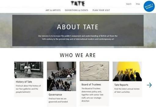
Left side menu with contact information present; White background contrasted with images and optionally a full-color header. A range of client's services displayed using high-quality images with a concise service description. An example of a secondary page layout:
https://images.app.goo.gl/eedUaEF4ZAvxopFZA
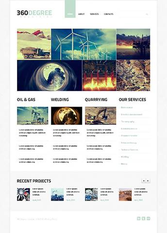
Instructions are the same as forthe previous page.
Contact page:
White or light grey/beige background with (optionally) two main sections: 'free estimate' and 'schedule appointment'.
Free Estimation (contact form: name, email/phone, type of service, description/message body).
Free estimate page for clients with urgent problems and high budget; Filter high-budget clients and highly lucrative projects;
Free estimate form sample: https://images.app.goo.gl/2GMua5ZZY1akjt2n7
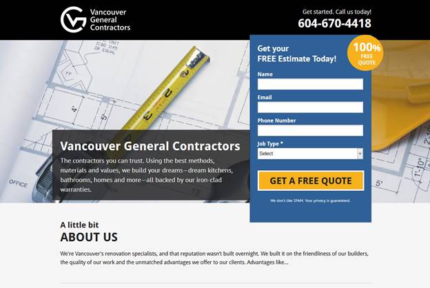
Closing page:
https://images.app.goo.gl/f28iezr1TkM6AWVDA
Book Appointment (contact form) example (clean, simple to fill out): https://images.app.goo.gl/3yfKyHuKaL51fzJk9
Easily readable layout with image descriptions and a light blue background as seen here: https://images.app.goo.gl/z8zKauMSe9Wpuxga9
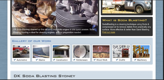
Medium-sized images that showcase the client's best work laid out with sufficient white space and no borders for a minimal look.
Tertiary pages, subpages (optional): each specific sandblasting service may have an individual page describing the services in question with images that illustrate the text. Guidelines:
White background with text centered differently across pages for versatility; Medium-sized images without borders. Clear, concise, SEO text describing the particular service.
Features:
Search bar all-present across the website. Clean, simple, as seen here:
https://images.app.goo.gl/Lw4YJfzCpAcDB68S9
https://images.app.goo.gl/iHvmH7ABRddg3TVD9
Set up to gently contrast the background and to highlight text when hovering over and typing.
Map (optional): a form to show the shortest path from the customer's address to the client's office as seen here:
https://images.app.goo.gl/qv9c8U8MVNNRrPJF6
Animation suggestions: Subtle animations for seamless user experience, but not too much to appear as if seeking attention. Hovering over the header highlights the text such as here: https://thenextweb.com/dd/2017/11/08/psychology-web-design/
Drop-down header and slide (disappearing side) menu.
'Back to top' button present on longer pages, clean and simple design:
https://images.app.goo.gl/qFNBDs6D8xViB5u88

https://images.app.goo.gl/DLZX3rJqKJCqnyns6

https://images.app.goo.gl/SmfYECpGihy4CYxh6

Font suggestions: White, clean, large;
1. Archivo https://fonts.google.com/specimen/Archivo?selection.family=Archivo
2. Spectral https://assets.awwwards.com/awards/gallery/2018/05/google-fonts-collection-awwwards16.jpg
3. Roboto
https://assets.awwwards.com/awards/gallery/2018/05/google-fonts-collection-awwwards2.jpg
4. Work Sans
https://assets.awwwards.com/awards/gallery/2018/05/google-fonts-collection-awwwards12.jpg
5. Arvo
https://assets.awwwards.com/awards/gallery/2018/05/google-fonts-collection-awwwards25.jpg
6. Ubuntu
https://assets.awwwards.com/awards/gallery/2018/05/google-fonts-collection-awwwards28.jpg
7. Oxygen
https://assets.awwwards.com/awards/gallery/2018/05/google-fonts-collection-awwwards213.jpg
8. Exo 2
https://assets.awwwards.com/awards/gallery/2018/05/google-fonts-collection-awwwards3-1.jpg
9. Open Sans
https://assets.awwwards.com/awards/gallery/2018/05/google-fonts-collection-awwwards22.jpg
10. Noto Sans
https://assets.awwwards.com/awards/gallery/2018/05/google-fonts-collection-awwwards34.jpg
Following adjustments are advised to reduce the bounce rate:
· Optimize pages to load within 2 seconds or less; Adjust images, videos, and animations to avoid slowing down the website.
· Proper content design (structured with a hierarchy of headings and subheadings with frequent use of bullets and numbering);
· No advertising and banners, side-bars and widgets used sparingly;
· An effective call to action is said to reduce bounce rate. With targeting high-budget clients, a call-to-action might be related to getting ‘heavy welding/sandblasting project’ estimation (‘heavy welding/sandblasting project’ implies large-scale commitment’).
· Logical internal linking. Pages should lead to other relevant pages.
· Easy navigation. Logical website structure with search results relevant to the query.
· Good mobile optimization. There shouldn't be a lack of relevant information in a mobile version and non-priority elements should be minimized or excluded.
Source: https://www.wordstream.com/blog/ws/2016/04/07/reduce-bounce-rate
Nadezhda Ganova
Bold underline I did to emphasize which parts struck me as particularly valuable.
Yellow highlight I did to the notes I added, which her work inspired me to see where we could use her talents in particular areas in the future.
Green emphasized the mistake, yellow was the correction. … breakdown of the the ONLY A SINGLE “THE” IS NECESSARY key elements…
Blue was to highlight my notes on possible future terms for our ongoing relationship.
Grey was an addition I thought made complete something she mentioned. Something she overlooked.
To be honest, the concept of sandblasting was completely new to me. So, before beginning with the current report I started with the obvious – I googled Sandblasting.
There is no need to go into details on what is sandblasting as you already know this. What I want to note here is what made me the biggest impression. …What made the biggest impression upon me…
1. It is extremely important that sandblasting is done right
Since sandblasting can be done to both roughen a smooth surface and smooth a rough surface it is critical that you hire the right professional. For me, this would mean finding a company with presence instead of the first number found in the yellow pages.
In regards to the reports, this would mean getting to know the competition, there their strengths and weaknesses, and how to eventually stand out amongst the crowd.
2. Many people still don’t know what sandblasting is
Another thing that made a big impression for upon me is that the top results (I would have liked a link so I could see what you saw-without it your merely stating something unfounded) were all about what is sandblasting, and there were almost no specific companies presented in the list. (Without knowing the precise keywords you searched, that may or may not be expected-top results of what? What did you search? I can’t give your observations any credibility without that info) This leads me to the conclusion (I like you reading between the lines, seeing what’s not obvious) that people often look for more information on sandblasting instead of looking for a company directly. This provides an opportunity for the website – provide this information to the user. Scheduling regular blog posts on the topic will improve the SEO because the search engines will index the new content. Is this for bringing visitors from all over the world to my website? Or is this to catch my local customers with money in their pockets ready to trade for my services I sell? Is there a difference? There is no need to have daily posts published on the website. One post a week or even every couple of weeks should be sufficient for the desired end result. Is it posted on my website, or somewhere else?
3. After-hours-welding website is not very user friendly
As a user, I prefer to see nice, clean and well arrange websites that are easy to use. You say you care about your customers? Give them a professional-looking website that is on track with the trends. Your wasting time stating the obvious The impression from your company’s website corresponds to the expectations a new client will form in their mind.
Based on the above conclusion I have the following suggestion for the actual reports.
For a $50 report, I suggest one of three options.
Research report
A structured report of 1000 to 1500 words. It’s not an article that is to be published on the web. Its info and guidelines that will be used in designing/creating the new website. It’s us harvesting the secrets that will enable us to make a world class website on sandblasting so I get many new customers who will spend their money with me. I do not want to limit the secrets we harvest according to size. I want as much info as I can get for my dollar.
Complete online research for the needs of the report.
Proofreading of the report and running it through specialized software (Grammarly), ensuring there are no typo and grammar mistakes.
Two blog posts
Two blog posts of 500 words each. Why not one? Why not one a week? Why not ten? Why not 100? Teach me the reason why. That’s what one of the things I want to purchase-THE ANSWER.
Keywords and links included in the posts for SEO purposes. Explain this further please.
Infographic
One infographic info graphic about sandblasting (if enough statistical data is available) – people do tend to like visual presentation. Forgive me, but I don’t know what a info graphic is. I’m a Sandblaster Welder with lots of money to build a new website with. Help me. Teach me.
For the topics of the upcoming reports, I would prefer if they are agreed with you beforehand. I do agree. Please find some of my initial suggestions below.
Report topics
What differentiates the top google results for sandblasting from those falling behind?
Which are the top 10 sandblasting companies presented in the google search and why are they on top of the list?
After-hours-welding website detailed review – what is good and what should be improved?
Blog post topics
X great effects of sandblasting
XX places you should clean with sandblasting
What is the difference between a blog and my normal website pages full of content?
If the job is assigned to me, more topic ideas surely will come to mind after I get into more details. Yes, the gems discovered and harvested are proportionate to the length of time the hunt goes on for.
Any ideas and guidance you have in mind are also welcomed especially in this early stage. I have lots.
About me, I believe I am a hard working hardworking and a dedicated person and I can help you achieve the result you are looking for – stand out as a company that cares about their clients and will provide them the professional service they need.
Chris’ opinions.
Most people thought this test report was about how they would spend the $15.
What I wanted was, to learn how/what they would do for the money.
You did very well at recognizing what I wanted. Much better than most.
Many of your recommendations were not clear to me with specificity, how you would achieve your stated objective. I though there were many place you could have gone much further in-depth, deeper elaborations would have been very valuable to me. In case you have not noticed, I do not have a small website. I do not like teeny-tiny-small answers, except when yes or no is appropriate. I am a research fanatic. I do deep in depth. I see generally what most people can’t see. And that’s the type of person I want to hire. We are not looking to follow the leaders to the top. We are aiming at researching, discovering the secrets that let us carve the path to the top so others will be left following us. Many of your answers or recommendations lacked profound distinctions.
I have a strong suspicion you gained a clear understanding of my goals. But that’s a suspicion. I also alternately wondered if you might just be repeating back to me my objectives I stated I was after. I couldn’t tell which was right, or if both were right. You actually have me sitting on the fence, undecided.
I’m strongly contemplating giving you another report to do, as a test, and to have you dig up some real info while you’re at it.
The biggest thing I didn’t like, was how little writing you did. It was very short compared to what I had hoped for, compared to several others I received back.
I’m going to give you another project. But please clean this one up and make it complete for me in the areas I mentioned it was on the shy side of.
As your report stands now, it got an 8 out of 10. I’m hoping you can polish it to a 9.5 or 10 out of 10. Can you? Will you finish this?
Here is where you can see how you compared to the competition. http://after-hours-welding.com/pages/blast_content/grade_the_applicants.htm
Website content
Report #1
The goal of the current report is to research the answers to the following questions:
When you are a sandblasting company it is obvious that the content you present to your clients won’t be about how to arrange your back yard. Putting aside the relevance of the information, however, there is a number of rules that should be followed if you want to provide high-quality content to your readers. Below is a list of the best practices approved by many successful content writers and proofreading specialists.
The style and wording you use throughout the article should be aligned to your target audience. If your readers are people who need to hire a serious company to take care of their home they would look for specific information on what and how will be done. If the author tries to be clever this would most probably waste the readers’ time and would bounce them back to the next company in the search result.
Research your keywords
Keywords in SEO are the words and phrases that allow search engines to find and display your content to the users. For optimal results, they should be inserted in the page title, the slug (URL), H2 heading and the content itself. The keywords can also be added to the meta descriptions and even to the image alt tags.
There are multiple tools for keyword research that can help you find what your target audience is looking for. These tools will not advise you what to write about. They will help you, however, to include the words that will help you rank higher.
One such tool is Soovle. It is free and helps you see what people are looking for across different platforms.
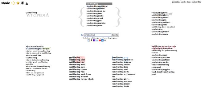 Professional content writers recommend using different tools to get a broader view of popular user searches.
Another simple tip is to explore autocomplete suggestions for ideas on what people look for.
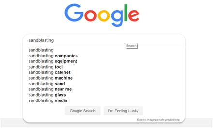
Some SEO experts recommend that you use long tail keywords to improve your ranking faster. It is easier to gain higher authority for keywords that are less competitive, for example, What is a reasonable rate for sandblasting instead of Sandblasting rates. Once you improve your ranking it would be easier to get noticed for the more competitive keywords.
Use internal and external links
Another element that search engines love to look for is links.
Links in your content can be external and internal. External links are used to lead the users to different sources you have referred to. Backing up your point with sources and references helps in building trust with your clients.
Internal links, on the other hand, allow the user to quickly access other related information from your own website.
When it comes to links, there are several tips SEO experts recommend to be applied when writing content for the web:
1. Link anything you are referring to so the reader can access it quickly without having to search for it.
2. Use contextual links instead of “Click here to...” statements. For a smooth reading experience add the link as part of the sentence.
3. Update your old content with new links. If you write new content that is relevant to something you already have, don’t hesitate to go and update the old post as well.
Keep sentences short and paragraphs shorter
Writing for the web is not like writing for print. The information should be presented to the user in a clear, easy to understand and concise form.
A common practice, proven to work best for content writing is to keep the sentences and paragraphs short. This allows the users to quickly scan through the content for the keywords they are looking for before starting to actually read the article.
According to a research of the University of Maryland “on average, users read about 20 percent of your content per page. Most users visit a web page for 10-15 seconds. In that brief time, 80 percent will skim the page for keywords they already have in mind”. To keep the attention of the readers content should be easily scannable. To do this the writer should make the post as visual as possible. This can be done by using headings to visually separate the content. This is especially important if the article is longer than 700 words. Short paragraphs (up to 5-6 lines), as mentioned earlier, also provide the users the ability to scan for the keywords they are looking for before going into details.
SEO experts also recommend to use images and videos, to emphasize quotes and to use bullets. All of these elements form the visual structure of the post. If your ranking is within the top 10 the usage of lists will help you appear as a featured snippet.
A featured snippet is the block of information displayed on top of the Google search results page. The main goal of the snippet is to provide a short answer to the user’s question. The displayed information could be a definition of a term or process, a step-by-step guide or a numbered or bulleted list.
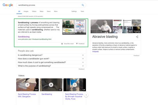
THANK YOU FOR ADDING THE SCREEN SHOT EXAMPLES SO OUR FUTURE WRITER, WHO EVER THAT MAY BE, HAS CLEAR EXAMPLES TO WORK FROM.
Writing the actual content
A good practice before starting to write the actual content is to create a detailed structured beforehand. A detailed and useful step-by-step guide is compiled by Social Media Week:
Step 1 – Know the main question you’re answering i.e. what it is your audience is asking or wants to know.
Step 2 – Know the message you are trying to convey in your blog post i.e. what your answer to the question is and include this in your first paragraph.
Step 3 – Create a list of things you will cover in the article i.e solutions you’re offering, tips for doing something and so on.
Step 4 – Bundle these ideas together with headings and subheadings.
Step 5 – Finally order these topics either thematically, chronologically or step-by-step problem-solving.
· Thematic ordering will be based on different subjects at a time, perhaps colour then size, then style.
· Chronological ordering will be in time order that an event has happened or how to do something.
· Problem-solving will be stating the problem then offering a new solution with each new heading and paragraph.
Once you have this structure it will be a lot easier to be consistent throughout your content. It will also allow you to start from wherever you feel comfortable without losing the smooth reading experience when the post is completed.
Most SEO experts turn specific attention to the opening of the post. It is extremely important to keep the intro to the point and include the main idea in the first paragraph. This first paragraph is what most of the users will read and based on the information it brings they will decide whether to keep reading or bounce back to the search results.
Another good recommendation is not to start a paragraph by referring to a previous one. When looking for specific information many users read “between the lines”, and having to refer to information stated elsewhere might confuse them when scanning the post. If you need to make a reference do it in the second or third sentence of the paragraph when you know the user is reading and not just scanning.
Proofread a while after you are done
One thing all content writers agree on is the importance of proofreading. Ideally, you should not review your article yourself. A second pair of eyes often sees things you haven’t noticed because you take for granted. Still, if you don’t have anyone to send the content to, here are some tips on how to proofread your article more efficiently:
· Read it out loud – it will help you notice duplications, misunderstandings or simply to improve the flow.
· Run it through a proofreading software – there are many free and paid software solutions to help you fix typos, grammar and punctuation errors. Some paid versions also recommend better word usage, warn for complex sentences, etc.
· If time allows, read it again on the next day – if you try to proofread right after you are done writing there is a big chance you will miss many small errors that you would otherwise notice right away. If possible, leave it for the next day. If time is pressing, go for a walk, have a coffee or do whatever you like to do to relax before editing your content.
Used resources:
In today’s content-oriented marketplace the content you produce is as important as the design of the website itself. With proper SEO, the content is what drives most of the traffic to your pages and help you stand out from the competition.
According to a Salesforce study, 64% of customers say that “content authenticity” and “the helpfulness of content” are major factors in their decision to stay with their solution provider.
Used resources:
· 7 Easy Tips for Effective Content Writing
While it is easy to set some rules to follow that will improve your content, it is not so easy to define what makes website content bad. Here are some points to check after you have prepared your post:
Used resources:
· Best practice content writing
If we turn back to the Salesforce survey it clearly indicates that bad content affects the trust customers have in a brand:
Used resources:
The obvious way to apply the above to the content for the new website is by simply following the best practices approved by the experts in content writing and SEO.
When a large amount of content is expected some of the above-mentioned sources recommend the preparation of a style guide. Style guides are used to advise the content writers on how to be consistent across the different posts. For example style guides will include information on should you capitalize only the first word in a title or each word, what fonts and indentations do you use for quotes, etc.
If I am hired to write content for the new website you can expect that I will apply the above best practices to ensure you are provided with quality content.
Nadezhda
Report #2
In the current report, I will show you how to apply the above principles while writing the content for the new website. To illustrate it all I will show you examples from mentioned tools and from the posts that made it to the Top 10 in Google.
The report ends with a cheat sheet of the things you need to check before submitting your final content.
When preparing content for the web each writer should go through three stages: Preparation, Implementation, Proofreading. Here is a step-by-step guide on how to write good content.
Preparing for writing your content is as important as writing the text itself. Here are the key stages to prepare for great content.
Before you start to write you should have an idea on what are you actually going to write about. IT’S EASY FOR ME. WE SANDBLASTED A METAL STAIR CASE, I TOOK LOTS OF PICTURES AND SOME VIDEO OF. THEY ARE IN A FOLDER. WHEN I’M READY TO USE THOSE PICTURES, THERE IS THE SUBJECT. To be sure the topics they cover are up-to-date pro writers do keyword research. IN THE PAST I WAS NOT GOOD ABOUT DOING KEYWORD RESEARCH LIKE CHECKING OUT GOOGLES AUTO COMPLETE OR THE OTHER METHODS YOU MENTIONED. I PROBABLY MISSED A LOT.
Depending on your current ranking you may go for short or long-tailed keywords. If you are still building up your ranking you should try to go with longer keywords as they are less competitive.
I HAVE BEEN USING GOOGLE ADWORDS FOR YEARS. SINCE I PAID THEM FOR EVERY CLICK, THEY KEEP A FULL HISTORY OF EVERY CLICK I’VE PAID FOR. AND THAT HISTORY INCLUDES WHAT THE KEYWORDS WERE THAT THE SEARCHER TYPED IN WHEN HE RECEIVED MY ADD HE LATER CLICKED AND I PAID FOR. I CAN DOWNLOAD THIS HISTORY. I HAVE SHORT AND LONG TAILED KEYWORDS. WHAT’S GREAT ABOUT MY HISTORY, IS IT SHOWS THE DATA OF HOW MANY SEARCHES WERE INSTIGATED FROM A PARTICULAR KEYWORD OR PHRASE. I CAN SEE WHICH WORDS ARE MOST POPULAR AND LEAST POPULAR. AND WHICH WORDS NEVER GOT CLICKED. ADD THIS TO OUR CHEAT SHEET; TO EXAMINE MY ADWORDS HISTORY DATA WHEN DOING KEYWORD RESEARCH FOR A PARTICULAR SUBJECT.
Here are three tools to use for your keyword research depending on your current needs.
If you need ideas on what to write about AnswerThePublic is the perfect tool to feed you a huge list of long-tailed keywords. The tool is free to use and does not require user registration. GOOD.

If you look at the image above you will notice that the dots for each suggestion are a different shade of green. The brighter the green dot is, the more competitive is the keyword. THANK YOU FOR TEACHING ME THAT.
To check the results for each suggestion you could simply click on the text or on the green dot.
If you are looking to target a specific platform like Google search, YouTube or Amazon the best tool to use is Soovle.
The main advantages of Soovle are that it is free to use, does not require user registration and show the suggestions based on the specific platform.
If you want to check the results displayed on each platform for the suggested keyword you should click on the keyword, for example, click on YouTube’s sandblasting wood keyword to see the top YouTube search results for it.

You have the main idea in your mind and you have selected the keywords you want to use. There are several advanced details that you might want to check. One of the best tools to do this is Ubersuggest.
This tool is also free to use and allows you to see how searchable is the selected keyword and how difficult it would be to rank higher for it. If you are still not sure that this is your keyword you could check the Keyword ideas from the menu where the platform will suggest you longer-tailed keywords that may be more suitable for your current ranking. THANKS TO YOU, I EXAMINED THIS PLATFORM AND I LIKE IT. GOOGLE ADWORDS HAS A SIMILAR FEATURE FOR KEYWORD IDEAS BUT IT WONT SHOW ME MY COMPETITORS.

For additional free and paid keyword research tools you could as well refer to 10 Best Keyword Research Tools (Free and Premium). I REALLY LIKE THAT WEBSITE. MAKE SURE IT’S IN THE CHEAT SHEET IN OR RESEARCH KEYWORDS CATEGORY. PLEASE.
Preparing the structure of the post before you start writing will help you to be consistent with your message to your readers and to deliver a smoother reading experience without jumping from one topic to another. Building your structure will also help with making the content skimmable. As mentioned in the previous report most users first check the title, first paragraph, headings and subheadings, and just then decide whether they will start reading the whole post or not.
To prepare the structure for your content Social Media Week recommends that you note down the following details:
1. Main goal – the question you want to answer in your content and the message you want to convey;
2. List of ideas – the list should include the things you want to cover in your content. Preparing the list will help you stick to these ideas without getting distracted from the natural flow of your mind;
3. Headings – organize the ideas in headings so they are easily scannable from the reader;
4. Subheadings – sub-ideas for additional visual organization. Subheadings are applicable when you are writing a longer post.
Here is an example from ProBlogger on how headings and subheadings could eventually shape your post by adding additional whitespace and highlighting the main ideas.
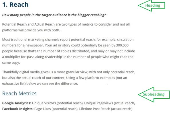
YOUR GETTING BETTER AT USING SCREEN SHOTS SO I HAVE A VISUAL AND NO UNANSWERED QUESTIONS IN MY HEAD.
You may have prepared great content and yet it may not be enough to make it desirable for the audience to click, read and share your post. For this, you need a great title as well.
Having an engaging title is equally important as having well-written and optimized content.
In 2017 Buzzsumo analyze 100 million headlines to answer the question of what makes a title more intriguing to the readers.
According to their study, the most engaging headlines contain between 10 and 20 words or between 60 and 100 characters.
The research also provides a list of the top starting phrases for headlines, that could be used for inspiration when deciding on your title.
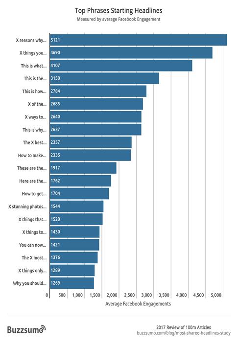
LETS KEEP ONE THING IN MIND. MOST BLOGS MAKE MONEY FROM ADVERTISING SO THEY WANT AS MANY READERS AS THEY CAN GET. THAT IS CLEARLY NOT ME.
I WANT CUSTOMERS THAT HAVE A NEED, HAVE MONEY TO SPEND TO BUY THEIR SOLUTION. MY WEBPAGE SHOWS I HAVE DONE THE TYPE OF WORK BEFORE, THAT THEY ARE NOW LOOKING TO HIRE. THAT IS THE ONLY PERSON I WANT TO CALL ME. THAT IS THE ONLY PERSON I WANT MY KEYWORDS TO BRING TO MY WEBSITE. EVERYBODY ELSE IS A WASTE OF MY TIME. SO IF YOUR MY CONTENT WRITER LATER ON, REMEMBER THIS. DON’T BRING PEOPLE TO MY WEBSITE OR GET THEM TO CALL ME, UNLESS THEY HAVE MONEY TO SPEND ON MY SERVICE.
Here are some other tips on how to think of the perfect headline for your post, as seen by Hostgator:
· Pay attention to headlines you like – if you like them and click, so do other people interested in the same topic;
· Use your keyword research – sometimes a long-tailed keyword is half the title you need;
· Write multiple titles for each post – you could share them with friends or co-workers to get their opinion or simply choose the one that sounds best after a few hours;
· Don’t promise things you won’t deliver – the so-called “click-baits” may drive some readers to your current post but if they leave the post disappointed they may not return for your other posts as well;
· Be specific – tell the audience exactly what they will find or what question will be answered in the post;
· Consider your audience – not everyone should like your titles. Analyze the response you are receiving and if you find out what your target audience prefers “How to...” instead of “X reasons why...” headlines, then use this to your advantage.
If you need additional inspiration for choosing your title here are some more examples from Location Rebel – 15 Types Of Blog Post Titles That Get Clicked: A Beginner’s Guide.
No website content is completed without a catchy image or other visual elements for your post. ARE MY WEBPAGES LIKE POSTS?
There are several ways to provide visual content for your posts.
After you have selected the images that will fit your content best you need to optimize them for the search engines. To do so follow the tips below, as advised by MasterBlogging:
If you have followed the above steps then by now you have a detailed plan on what you are going to write. When I start writing my structure looks something like the below:
Intro
Body
Heading 1
Subheading 1-1
Subheading 1-2
Heading 2
Subheading 2-1
Subheading 2-2
Summary
This will ease the actual content writing because:
When it comes to the writing itself, however, there is no ultimate procedure to follow. It all depends on your style and knowledge of the topic. Still, there are some tips that could guide you and examples how other bloggers apply them.
· State your main idea in the very beginning.
· Keep paragraphs up to 5 or 6 lines.
· Use mostly short and simple sentences.
· Use bullets and lists where possible.
· Use your keywords at least 4-5 times throughout the content.
· Add the keyword to the page slug.
· Use internal links to guide the user through your website.
· Use external links for credibility and building trust.
· Make sure all links are contextual. Contextual links are a part of the sentence that does not interrupt the reading.
◦ Good example: For more details please refer to our Privacy Policy.
◦ Bad example: For more details click here to refer to our Privacy Policy.
· Ask a question to the readers so they may leave a comment. I LIKE THAT. MAKE SURE IT’S INCLUDED IN OUR CHEAT SHEET.
· Provide added value to the content – give the readers something more than they were looking for (a discount code, a template, a guide they may want to refer to later).
Below is an example of a highly optimized post from a source that used the power of SEO to their advantage.
Mediablast’s How to size a small piston air compressor for blast cabinets
◦ in the title (How to size a small piston air compressor for blast cabinets);
◦ the slug (https://www.mediablast.com/blog/2019/03/14/ow-to-size-a-small-piston-air-compressor-for-blast-cabinets/);
◦ the image file name (Small-Piston-Air-Compressor-Sizing-FB1-604x270.png).
◦ in the first sentence (We often get asked which small piston air compressor is needed for a particular abrasive blast cabinet.);
◦ in the first header (5 Tips for Finding the Right Size Small Piston Air Compressor);
◦ a total of 4 times throughout the content.
◦ NOW YOUR RESEARCH IS BACK ON TRACK, RELATED TO WHO YOUR CUSTOMER IS. AND IT IS WELL DETAILED SHOWING YOU DUG DEEPER.
The final step before submitting your content is to make sure your content is well written and there are no typo, grammar or punctuality mistakes.
As mentioned in the previous report the best way to proofread your post is to give it to another person for review or at least to give your mind some time to rest before proofreading it yourself.
To verify the content by yourself it is recommended to read it out loud first to make sure the flow runs smoothly. Once you are satisfied with the actual content and the ideas you have presented all you have to do is check your you’re spelling, grammar, and punctuation. The easiest way to do this is by using an online tool. One such tool is Grammarly. The platform requires user registration but is free to use for general proofreading. After pasting or uploading your content the platform will alert you on the mistakes, usually with a short explanation. Another great feature of Grammarly is that double-clicking on a selected word from your content will show you possible synonyms to avoid duplications.
Although Grammarly is my personal favorite there are many other tools such as Ginger, WhiteSmoke, ProWritingAid and many others. The below image from Masterblogging shows the main advantages of the most popular proofreading platforms. MAKE SURE THESE OPTIONS ARE INCLUDED IN OUR CHEAT SHEET.
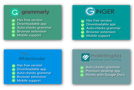
Writing for the web is nothing like writing a novel. Being a talented writer is a great advantage, however, it doesn’t guarantee you high ranking with the search engines and top page in Google.
The last two reports covered the basics of content writing as recommended by those with experience in the field. Report #1 is meant to introduce the best practices when it comes to writing content for the web, while Report #2 is a step-by-step guide on how to apply these principles. I LIKE THE WAY YOU’VE WOVEN THEM TOGETHER AND SORT OF MADE IT A CONTINUATION OF.
For future reference, please find below a content writing cheat sheet listing the key points explained in the two reports. The cheat sheet will support you (MAYBE YOU) in delivering high-quality posts that are optimized for a better ranking with the search engines.
Nadezhda report 3 results made a CHEAT SHEET.
◦ If you need inspiration - Answer the public
◦ If you want to target a specific platform – Soovle
◦ If you have selected your keywords and want to analyze them – Ubersuggest
◦ Main goal
◦ List of ideas
◦ Headings
◦ Subheadings (if needed)
◦ Include the keyword in the title
◦ Include the keywords in the file name and ALT text
◦ Resize the images using PicResize or TinyPNG (if needed)
IN THE LAST REPORT I HIGHLIGHTED THE FOLLOWING AND SAID GOOD INFO. SO WHY IS IT NOT HERE IN OUR FUTURE GUIDELINES/CHEAT REPORT?
“Keywords in SEO are the words and phrases that allow search engines to find and display your content to the users. For optimal results, they should be inserted in the page title, the slug (URL), H2 heading and the content itself. The keywords can also be added to the meta descriptions and even to the image alt tags.” GOOD INFO. THAT’S USABLE.
I’M PAYING YOU TO RESEARCH, FIND, GATHER AND SAVE THE INFO WE WILL USE AS OUR DESIGN CRITERIA LATER. I WAS DISAPPOINTED THIS INFO DID NOT GET SAVED IN THE CHEAT SHEET/GUIDELINE.
· Use external links to other sources (if you refer to any)
· Prompt the user to interact by leaving a comment or make contact
I’M DISAPPOINTED YOU DON’T MENTION in the cheat sheet TO USE GOOGLES AUTO SUGGESTIONS FOR FURTHER RESEARCH AND INSPIRATION WHEN CHOOSING WHICH KEYWORDS AND PHRASES ARE TO BE USED IN THE CONTENT. AND I SPECIFICALLY COMMENDED YOU ON A GOOD JOB FOR FINDING THAT.
AND YOU FORGOT THE FOLLOWING: Another good recommendation is not to start a paragraph by referring to a previous one.
score 7 out of 10
Anthony Peter
Bold underline I did to emphasize which parts struck me as particularly valuable.
Yellow highlight I did to the notes I added, which her work inspired me to see where we could use her talents in particular areas in the future.
Green emphasized the mistake, yellow was the correction. … breakdown of the the ONLY A SINGLE “THE” IS NECESSARY key elements…
Blue was to highlight my notes on possible future terms for our ongoing relationship.
Grey was an addition I thought made complete something she mentioned. Something she overlooked.
The Ultimate Guide to Sandblasting Vocabulary
There are two types of clients in construction; those who are conversant with all the construction terms, and the clueless. Unscrupulous engineers prey on the latter to siphon their hard-earned money. One area that these engineers cum predators take advantage of is in the area of sandblasting. If you are planning on using sandblasting for your construction, this is your ultimate guide to protect you from the “engineers”.
· Abrasive.
It refers to natural or manufactured material that occurs in granular form. It is used to clean, abrade, or change the condition of a surface. To successfully achieve this purpose, abrasive is propelled at high speed through compressed steam, water or air. A good example of abrasive is sand.
· Abrasive Metering Valve
This is a device used to regulate the amount of abrasive passing through the blast machine into the compressed air stream.
· Angle of Approach
This is the angle at which the blast nozzle is held to the surface being blasted.
· Black beauty
Forget about the term used to refer to black ladies or fashion. In our context, black beauty refers to a black boiler slag abrasive.
· Blow Down
Blow down refers to the complete removal of rust, dust and any other residue by use of abrasive machine.
· Centrifugal Wheel Blast Cleaning
If you have been observant during the blasting process, you might have seen grit being propelled by two wheels to workpieces at very high speed. This is what is referred to as centrifugal wheel blast cleaning.
· Course Mesh Abrasiveness
This refers to abrasive which is least 90 mesh.
· Cyclone Separator
This is a special type of abrasive reclaimer that uses cyclonic action to separate dust, fine and reusable sizes of abrasive and dust.
· Deadman Valve
A deadman valve refers the control point in a blast nozzle. The operator closes it manually so as to activate the remote control system.
· Inhibitor
An inhibitor is a special chemical used to prevent rust formation on a surface that has been blast-cleaned.
· Media Blasting
Refers to the process of cleaning, improving or changing the appearance of objects by passing abrasive through it by controlled means.
· Multi-Outlet Blast Machine
If you are looking for a blast machine that cleans more than one place at the same time, try the multi-outlet blast machine. This machine has more than one outlet, and therefore more than one operators can use it at the same time.
· Pounds per Square Inch (PSI)
It refers to the force produced by the compressed air or pressure during the blasting process. It is measured in PSI.
· Rockwell “C” Scale
It is a measurement term used for measuring the hardness of metallic substances used in blasting.
· Sandblasting
It is a synonym for abrasive blasting or media blasting. The term sand blast is very common since sand was the first abrasive to be used.
You can see from the list above that there is a wide range of blasting terms. Don’t be used by unscrupulous constructors as Automatic Teller Machines. Let every coin coming from your pocket be accountable. WTF?
Chris’ conclusion.
The research was 80% correct. Not bad for a first round.
The grasp on American English was only about 85%. Some of his analogies were very weak. That means everything Anthony turns in must be passed by some other editor to correct his mistakes. That is a huge turn off for me.
There was not a single link or URL showing me where he got his info from.
The good: He did not tell me how he was going to spend his $15 as half or the other applicants did.
The layout and style was ok, but not impressive.
The quantity turned in was small compared to others. It left me with the impression he would spend less time on a project than this competitors.
I just wasn’t overly impressed.
Here is how he compared to his competition. http://after-hours-welding.com/pages/blast_content/grade_the_applicants.htm
score 1 out of 10
WHAT WOULD YOU DO TO EARN MONEY?
The dictionary defines research as, “the systematic investigation into and study of materials and
sources in order to establish facts and reach new conclusions.” As mankind has progressed, one of
the most significant tool discovered is the internet. A tool which potentially as no limits as a means
of spreading and receiving information. With the vastness of the internet at my disposal, I plan to
filter through an immense amount of data to find content which are not only useful or suitable, but
also give your work a certain uniqueness to ensure that your requirements are met and your client
base are well and truly satisfied.
Below, I have listed a few sites which show the meaning of research, as I believe to be appropriate
in this scenario.
Thank you
Sites
https://psychcentral.com/blog/the-3-basic-types-of-descriptive-research-methods/
https://study.com/academy/lesson/what-is-research-definition-purpose-typical-researchers.html
https://explorable.com/what-is-research
Chris’ Conclusions.
Here is the first sentence of my instructions. “So the first report (test job) will pay a flat $15. In your own words, describe what you will do for the money you earn.”
It does not say what will you do WITH the money you earn.
I was asking what she will do for me, for the $15 she earns from me. But She didn’t catch that as some others did. Actually several people didn’t catch that while half of them did get it right.
I admit, my instructions were not necessarily crisp and precise. I wonder, if my instructions were more detailed, and she was allowed to ask me questions, how her report may have been much better towards achieving my goals?
Furthermore, I gave her the instructions in MS Word docx format. She turned in her report in PDF which is very hard to copy and paste or edit. That means I can do virtually nothing with the data she mined.
Her report gave me the distinct impression she had no real interest in this job and does not want any more work from me. It looked to me as if she turned in something/anything just to justify her request for payment.
She is way too rich and thought $15 of test writing only justified a 10 minute investment of her time.
Her test report turned in was the smallest quantity of writing anyone out of the 12 applicants turned in. The substance of her work flabbergasted me in its diminutive nature and off target direction.
Score 5 out of 10
Mahbubur Rahman
What you or anyone may do for the money you or anyone earn
It is discernible to say that their exist only two things which can be done with the money if anyone earns, two of them are as simple to understand. These two ways are saving money, and spending money. The following narrative summarizes these two topics briefly of what you and I or any other person can do with the money which is earned.
Saving money:
Saving money is certainly a decisive practice, an assurance of your financial security of the future, which can furnish a security guarantee in case of emergency. There exist a plenteous reasons to save money.
For instance, the amount can be use in maintaining, repairing your house, household furniture, your car, to purchase some tools necessary for your household etc.
Need for sufficient saving becomes unavoidable after your retirement or when you are out of your job. Everyone faces this inevitable reality when they quit their job and struggles by on a pension. Earnings which is saved plays a significant role in this time of your need to invest in a business or financial projects.
Nowadays medical expenses are considerably high and ample amount of money has to be spent to remain healthy. Anyone can be injured on the spur of the moment. Impulsively, you can get sick. In such crucial moment you and I may face, this little amount of saving can appear as laying on of hands.
Spending Money:
We earn money to spend. Earning with an intention to save the entire amount is to build castle in the air. We need to figure out the way to spend this money intelligently, perhaps frugally. A persistent habit of frugality eventually pays off. Whether you have endured a prolonged economic deprivation or a lifelong enjoyment of financial convenience, tendency of being frugal is undoubtedly beneficiary in the long run. Make a budget to spend calculatedly.
There are plenty of psychological reasons behind spending money unnecessarily, most of them are avoidable. Most of us fall prey to the influence of advertisers. They successfully convince us everyday to purchase their products which may promise us to lead a lavish lifestyle. If you don’t have a plan to buy a product or service or you don’t have a budget to purchase it, you must abandon the idea of having it even in a discounted price. you have to resist the temptation of having more and remain resolute.
To get the low-down of this habit first thing one should do is to track the income and the way the person expenses. If you can appraise where your money is going, examine carefully about the product or service you purchase, evaluate the necessity of this expenditure, you will be able to single out the product you purchase for a generous amount, curtail the unnecessary expensive clothing brands by choosing discounted branded footwear and clothing. Jot down the advertisements you have seen in Web or TV which mentions “up-to 50% off” along with the household items you intend to buy.
Be conscientious when using home appliances to reduce the usage of electricity. Electricity bill is the most expensive utility bill for the average householders in USA. Some hints to reduce the amount of electricity bills are easy to follow. Turn of unnecessary lights, always prefer task lights in the desk, take shorter showers in winter to reduce the usage of hot-waters, electronics must be unplugged when fully charged. Open the window to allow natural air-flow to turn off air conditioner, hand dry your laundry etc. you can always count on green renewable energy.
Abandon the idea of spending money to show-off a pretentious luxury image to impress others. If you need to buy an expensive one, head for the store discounted some for the sale.
Spending money on others plays an important role in our financial life. As researcher found effects of sufficient amount of money on our mind is extensive, simultaneously the reason for being happy lies on spending money on others as well. Although this happiness can be earned only if you value the habit of spending on others. It can be emphasized that money can bring you happiness, and the notion relies on what you value much, and how do you want to spend on purpose you value most. In conclusion, it is reasonable to make a conclusion that you can be happy by spending money you have earned wisely on the things you value most. Do not spend more than you earn.
References:
https://ptmoney.com/best-things-to-spend-money-on/
https://www.ruleoneinvesting.com/blog/financial-control/spending-money-wisely/
https://positivepsychologyprogram.com/spending-money-promotes-happiness/
https://safetynet.com/blog/pyschology-of-spending-money/
Chris’ Conclusion.
Instead of taking the time to critique this and give specific feedback to help the applicant better understand how to do better in the future, I will save my time and just say I’m not interested in any more reports from this applicant.
The grasp of American English was too poor to consider receiving any more reports from this gentleman.
score 1 out of 10
Panagiotis Stefanos Sakellariou
Hello Chris,
Thank you for your info. Let me explain what am I capable of and what I can do for you in depth:
I have experience in the following areas:
Email Marketing
Social Media Marketing
Paid Advertising
Content Writing
I have checked your website, I have reviewed carefully the data I have collected and I prepared to send you my proposal for your job posting.
This is a list of tasks that I will perform weekly.
Optimize current website content
Research for new articles. website content
But if you ask me as a professional marketer what do you need to do in order to scale your business, you need to start from scratch and revamp your website. The current website is not customer-friendly and it seems you have not worked on your branding as well. A good and engaging website can bring visitors, which means potential clients.
Are you interested in discussing this option?
I can help you with content writing and research but in order to benefit from it fully, you need to have a strong and engaging website as well with proper SEO and social media marketing.
I am looking forward for your thoughts.
Best,
Greek Geeks Agency Member
skype: christina.bagkaki
Chris' assessment.
1st off he never sent me a report as everyone else did. He never showed me any example of any skills except that he cant follow any instructions. He was five days late on the deadline. All the opinions he stated about my website was information I gave to all the applicants in the instructions. He told me nothing new. He told me only what I had already informed him of.
Total waste of my time and he got a flaming review from me.